Alignment #
last modified February 24, 2026
~8 minute read
Alignment does three things at once:
- Creates Coherence.
- Conveys Care.
- Guides Interpretation.
Alignment Creates Coherence #
Simply put, objects that are aligned will feel more connected than objects lacking clear alignment. This point can be illustrated by returning to the groups of circles introduced on the page discussing proximity and separation. In that chapter, we saw that grouping like items helped us form associations between objects. One of the groupings we arrived at is repeated below, in which there is a clear connection between like elements communicated by their proximity.
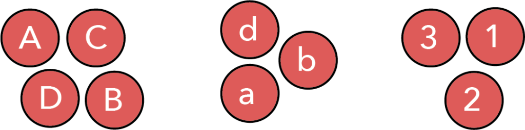
However, the feeling of connectedness between these grouped objects can be further improved by aligning objects within the groups. Our minds simply cannot avoid noticing when things are aligned, and we interpret such items as connected.$^\dagger$ This is illustrated in the figure below.
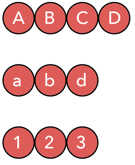
In this figure, we have preserved the grouping, communicated using proximity and separation, but have now aligned the objects within the group. This creates a much more cohesive feel. It is even more clear to the viewer which objects belong together, because of the clear alignment between them.
Alignment Conveys Care #
This is the aspect of design closest to ’tidiness,’ but it is also deeply connected to coherence. Our innate desire to see things as connected and aligned is why designs lacking clear alignment feel sloppy. The perception of sloppiness occurs specifically when we see things we expect to be aligned, but that are slightly misaligned.
Returning to the circles, if we attempted to create the same alignment as above but executed it poorly, we might end up with the following:
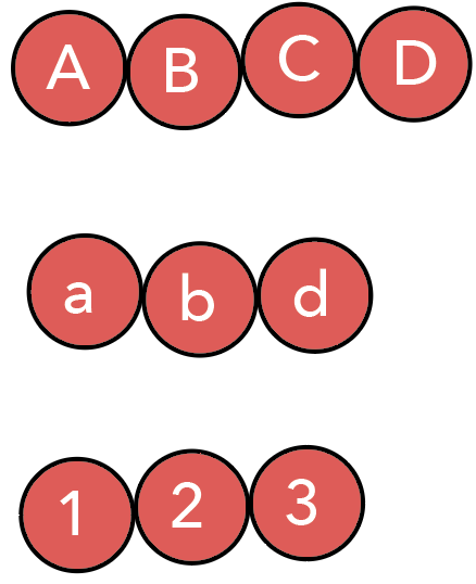
These groupings are still clearly connected, but the alignment is slightly off, giving the impression of a sloppy design.
It is important to note that this perception of sloppiness relies on subtlety; it requires that things are almost—but not quite,aligned. The very first image on this page also lacks alignment, but it is so far from being aligned that most viewers do not assume alignment was intended. Designs appear at their sloppiest when viewers feel alignment was intended but poorly executed.
Though this effect originates from subtlety, it is significant. We might hope our colleagues look past minor alignment issues, but people consciously and unconsciously form opinions based on how we present our data. By paying proper attention to alignment, we convey to the viewer that proper attention to detail was paid in all other aspects of our work. Thus, tidiness in design helps lend a sense of confidence to the overall work.
Alignment Guides Interpretation #
As was the case for proximity and separation, there is yet another role for alignment—one that allows us to move beyond creating a tidy whole and helps us control how the user interprets what is being presented.
Let us consider our circles one last time. Looking at the versions aligned into rows, we can easily see that the top row has more elements than the bottom two. However, it is harder to know exactly why. If asked which elements are missing in the bottom two rows, it might take you a moment to determine the answer. However, we can alter the alignment to make it immediately clear which elements are missing, as shown below.
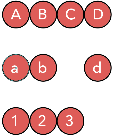
Now, we are using alignment to instantly show the viewer that we are missing the lowercase ‘c’ and the number 4. Interestingly, though we did not change the bottom row, shifting the lowercase ‘d’ signals to the reader that the column-based alignment is important, making it clearer that the bottom row lacks a 4. Thus, alignment is a powerful tool to communicate structural information across the entire design.
Alignment in data visualizations #
All of the above considerations come into play when making data visualizations.
1. Coherence #
Alignment is what makes a complex figure with multiple subplots feel like a single, cohesive unit. The most powerful tools for this are the plot axes. Aligning $x$- and $y$-axes across a grid provides strong horizontal and vertical lines that our eyes lock onto.
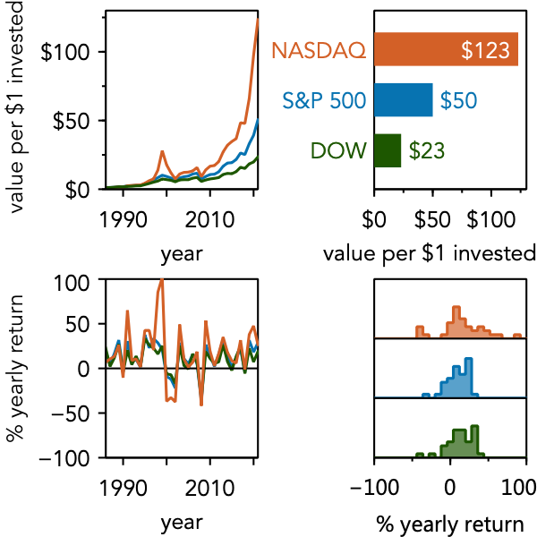
This is aided by ensuring consistency across data lines and markers, fonts, color, etc.
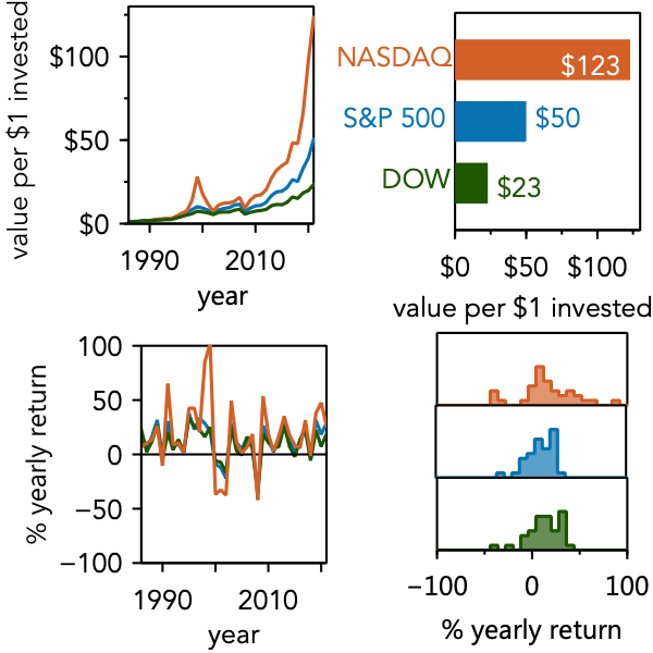
2. Care #
Conversely, a lack of alignment signals a lack of care. When subplots are almost aligned, the figure feels sloppy. This “near miss” (as shown below) is distracting and can unconsciously erode your audience’s confidence in your work.
3. Interpretation #
This is the most advanced use of alignment. You can use alignment—and the intentional breaking of it—to guide your user’s eye.
For example, in a culture that reads left-to-right, a 2x2 grid (like the one above) will be read like text: row by row.$^\ddagger$ But what if your data has a different logical flow?
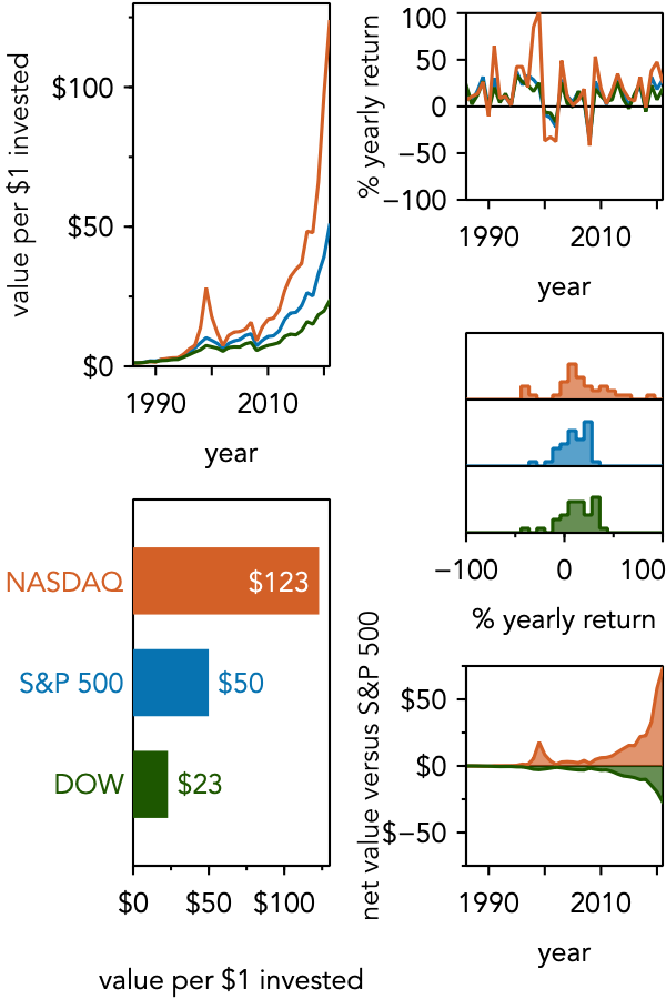
This figure breaks the horizontal alignment between columns. This visual “stop” encourages the viewer to read down the first column before moving to the second.
Alignment also guides interpretation within a single plot. We rarely have control over the alignment of the data points themselves, but we do for other elements. When directly labeling data, aligning the labels creates its own “column” that is easy to scan.
The lower plot’s alignment not only feels tidier but helps the viewer instantly compare the two labels, simplifying the task of understanding the data.
Some subtleties for realizing alignment #
As we will stress again and again, design is about how the viewer perceives it. And our brains don’t perceive alignment the same way a computer does.
It can be tempting to just select objects and click the “Align Center” button. But a computer aligns based on mathematical width. The human brain, however, looks for perceptual weight.
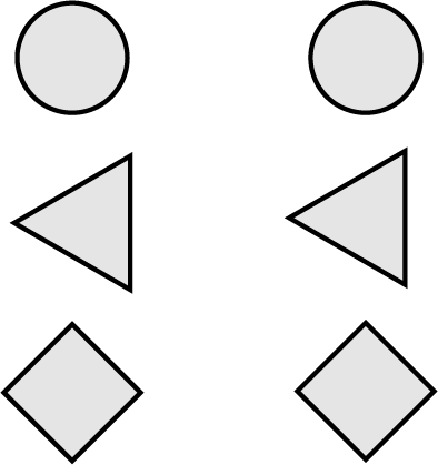
In the left column, the shapes are “perfectly” aligned by their width. On the right, they are aligned by their perceived center of mass. For vertical objects, our brain wants to see a stable “tower,” which is why the right column feels more aligned.
Why didn’t we need to worry about this with the grids of data plots considered above? The reason is that the axes and boxes around the plots provide a stronger guide for alignment than the centers of mass. This preference for strong lines can also be seen in text. Consider the letters on the left side of this paragraph. These letters are not aligned by center of mass, but we perceive them as aligned because of the strong vertical line they produce on their left edge.
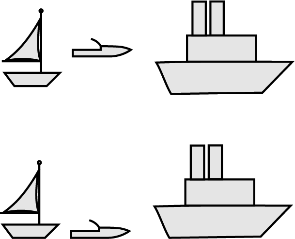
While vertically aligned shapes may need their center of mass to be considered, horizontally aligned shapes often give visual preference to their baselines. Just as our brain sees vertically aligned objects as a tower that might tumble, our brain sees horizontally aligned objects as potentially resting on a shared plane.
Again, we can see this in the text on this page. Though many letters have different heights, they sit on a common baseline, so we judge them as neatly aligned. Turning to shapes, consider the boats drawn below. In the top row, the boats appear to be comically misaligned—even though they are aligned by center of mass. We do not normally think of boats aligning by center of mass, but by their waterline. Thus, the boats on the bottom line appear well-aligned to us.
The point of this discussion is that we need to think when using alignment. Consider the objects being aligned and if they have strong lines that will guide our eye. If not, then a more careful consideration of visual weight is needed in order to ensure the design is perceived as aligned. As long as you do so, you will be able to produce designs that the user sees as neat, cohesive, and also subtly guides them in the reading and interpretation of your data.
Concluding remarks #
This has been a deep dive into alignment. Hopefully, you are convinced that it is worth your time to pay attention to alignment to improve viewers’ perception of your work. But more than that, alignment is a powerful tool to actively guide interpretation. Applied deliberately, careful alignment can elevate a piece of work from average to amazing.
Key takeaways #
- Alignment creates coherence: Aligned objects naturally feel connected and part of a unified group.
- Alignment conveys care: Imprecise or “near-miss” alignment appears sloppy, while sharp alignment signals precision and thoughtfulness.
- Alignment guides interpretation: You can use alignment (or intentionally break it) to dictate how a user visually navigates and reads your data.
- Align by perception, not just math: Consider whether objects should be aligned by an edge, a baseline, or their visual center of mass rather than strictly by their computed center.
$^\dagger$Sometimes this idea also goes by the name continuation. More information can be found in “Universal Principles of Design” by Lidwell, Holden, and Butler.
$^\ddagger$This pattern of processing information on pages is so common and so closely tied to reading that it is called a Gutenberg diagram. This is discussed in “Universal Principles of Design,” by Lidwell, Holden, and Butler.
page last modified February 24, 2026