Hierarchy #
last modified February 24, 2026
~6 minute read
Hierarchy is the art of creating a visual “to-do list” for the viewer’s eye, telling them exactly where to look first, second, and third.
Hierarchy is not just one concept; it is two:
- Hierarchy of Emphasis: Using visual weight (marker size, line width, color) to show what is most important.
- Hierarchy of Flow: Using layout, proximity and separation, and alignment to guide the viewer through a sequence.
Let’s look at both.
1. Hierarchy of Emphasis (Visual Weight) #
This is the most common form of hierarchy. You use it to assign relative importance. A magazine page is a perfect example:

Your eye does not process this randomly. It is guided by visual weight, and most people will process the article in the following manner:
- First: The large, bold Title.
- Second: The smaller Subtitle.
- Third: The highlighted Callout Quotes.
- Fourth: The main Body Text.
Some people might start with the callout quote, but they will still process the title and subtitle before the body text.
This order is not an accident; it is a direct result of using contrast in size, weight, and color. The power of hierarchy is so strong that you probably attempted to read the article this way, even though it is AI-generated nonsense!
2. Hierarchy of Flow (Layout & Order) #
This second type of hierarchy creates a path for the viewer’s eye to follow. It is about a sequence.

Here, the design uses alignment and spacing to create a clear flow. Most people will start at the very top, then look at the left column, then the right column, moving down until the next full-width block, then go left to right across the bottom. This layout establishes a hierarchy that guides the viewer to process the content column by column (in the top half) before switching to row by row (at the bottom).
The absence of this flow is what creates confusion. Look at this 3x3 grid:
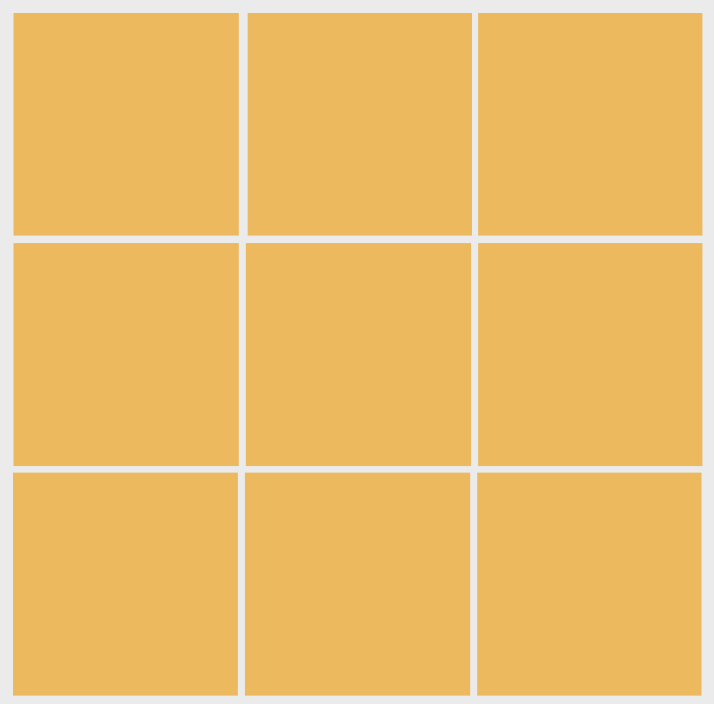
Where do you start? Top left (a bias summarized by the Gutenberg Diagram). Where do you go next? By row or by column? The design does not tell you. This ambiguity creates cognitive friction.
Hierarchy in Data Visualizations #
This two-part framework is essential for good data visualization. You use both types constantly.
1. Hierarchy of Emphasis (For Every Plot) #
Every single plot you make must have a clear hierarchy of emphasis. Your goal is to guide the viewer instantly to the “story.” A well-designed plot has a clear order of operations:
- The Story: What’s the main finding? (This is your main use of contrast or enclosure—the highlighted bar, the bright red line, the cluster of points).
- Title: What is this? (Highest visual weight after the data).
- The Context: How do I read this? (The axes, labels, and gridlines. These should be present but muted—often in a lighter grey—so they support the story without competing with it).
It is also important to understand that conventions within a field can play a role in how we want to use hierarchy. For instance, in graduate school, I was an synthetic chemist, and if I were to look at a UV-visible spectrum, I would naturally assume that the $x$-axis was wavelength, while the $y$-axis was absorption. Thus, unless these dimensions were different than the above, there was no need to call attention to them—they could sit low on the hierarchy. However, if the $x$-axis was something else (like units of energy), then I might want to place the axis higher on the hierarchy—maybe making the font size of the axes labels larger to call attention to it.
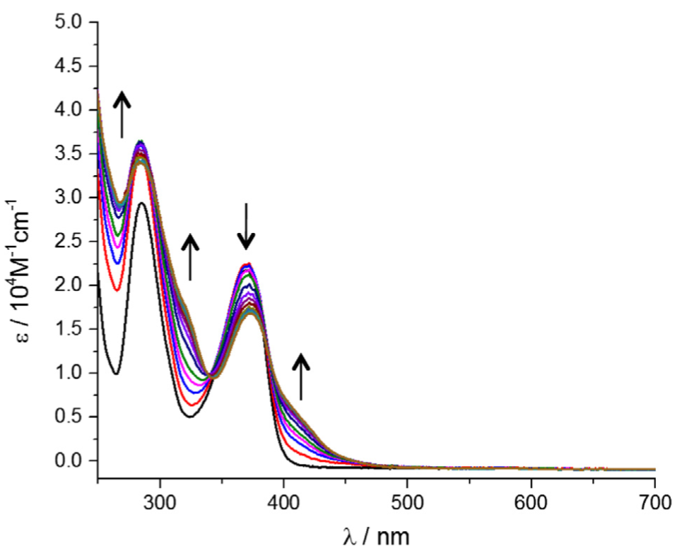
This image was taken from Kennedy, S. R.; Kozar, M. N.; Yennawar, H. P.; Lear, B. J. Synthesis and Characterization of the Gold Dithiolene Monoanion, (Bu4N)[Au(Pdt=2,3-Pyrazinedithiol)2]. Polyhedron 2016, 103, 100–104.
2. Hierarchy of Flow (For Multi-Plot Figures) #
When making a figure that has several plots, or a scientific poster, you will need to carefully consider hierarchy when you are designing and creating it.
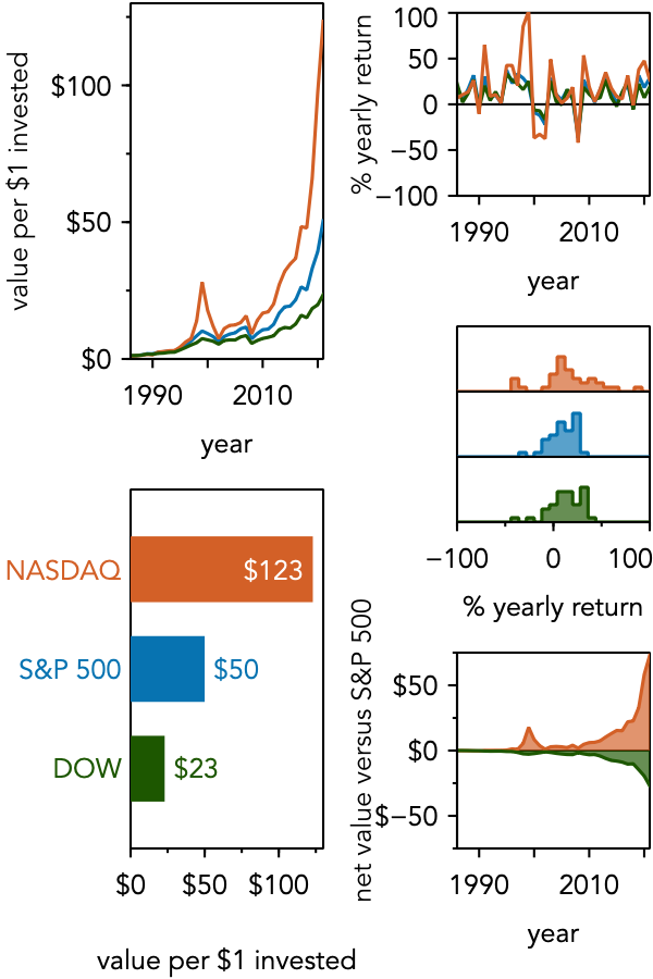
For instance, consider a figure that contains several subplots, that you might place in a journal article. Most people encountering such a figure will naturally start in the top left—again, following the Gutenberg Diagram. This suggests that the first point you wish to make should be placed in the top left.
However, once that is done, where should their attention go next? Remembering what we talked about above, if you don’t give people any indication otherwise, they will tend to want to read row by row. So, you can consider placing the next element of your story to the right. However, it may be that the structure of your data visualizations do not lend themselves to arrangement by row, and so then you need to be sure to use hierarchy to guide the eye.
Below is a design that uses the same trick of breaking alignment to force column-by-column processing.
A Note on Non-Linear Hierarchy #
It is also worth noting that what we are discussing might also reasonably be called ‘‘composition’’ or ‘‘armature.’’ These terms more generally refer to how things are arranged on a page to tell a story or create a feeling. For instance, imagine we had a case where we had a central idea, and then there were multiple ideas that stemmed from it. These sub-ideas don’t need to be processed in a particular order, but they are all connected to the central idea. We might use an arrangement like that shown below to convey this.

Hierarchy is the principle that turns a “dump” of visual information into a clear “story.” Without it, you’re making your viewer guess where to look. Master this, and you’ve mastered one of the most important skills in visual communication.
Key takeaways #
- Hierarchy of Emphasis: Use visual weight (size, color, boldness) to tell the user what is most important in a single frame. Ensure your data is at the top of the visual to-do list, and structural elements (axes, gridlines) are at the bottom.
- Hierarchy of Flow: Use layout, alignment, and spacing to tell the user the correct order to process information.
- Anticipate biases: Leverage natural reading patterns (like the left-to-right, top-to-bottom Gutenberg Diagram) to match your layout to human instinct.
page last modified February 24, 2026