Ordering of objects #
last modified February 24, 2026
~6 minute read
The good news is, while the data is infinite, the ways to logically order it are not. In fact, there is a surprisingly small number of possibilities, often called the “five hat racks."$^\dagger$
Five hat racks #
This expresses the idea that, given a set of objects, there are only 5 ways to logically order them:
- Chronologically. We could arrange all the athletes by their age, or the date at which they started competing in their event.
- Alphabetically. We could arrange all the athletes by their last name, alphabetically.
- By magnitude. We could arrange the athletes by height, or weight, most medals won, or furthest distance travelled. As long as we can quantify something about them, we can order by that quantity.
- Geographically. One could take a map of the world, and then place each athlete where they currently reside. This is an ordering of the people.
- Categorically. We could arrange them by some sort of non-quantitative property. Perhaps male and female, or by the type of medal they won, or by the country of origin.

Now, spend some time trying to think of other ways that you could organize the athletes, and for each one you arrive at, ask if this arrangement falls within one of the five hat racks. You will almost invariably find out that they do. Almost (see below).
Five hat racks in data visualization #
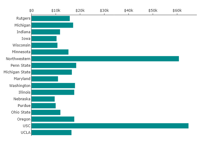
Consider in-state tuition at the universities belonging to the BIG10 conference in the USA. Imagine you wanted to make a bar chart, and you pulled the data for this and plotted it without considering the order. You would get a randomly ordered set of bars, much like the following.
This chart has all the information, but its default (random) order carries no meaning. It makes comparisons difficult and hides any potential story. So, let’s apply the five hat racks to tell different stories.
Chronological #
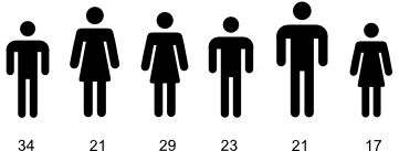
One way to think about these schools is when they were founded or when they joined the BIG10. We can order the bars in chronological order, by founding date, and we get the following:
Now, one can look at this plot and determine if there is a pattern in terms of the year founded. There clearly is not, but we can see this directly in a way that we could not before.
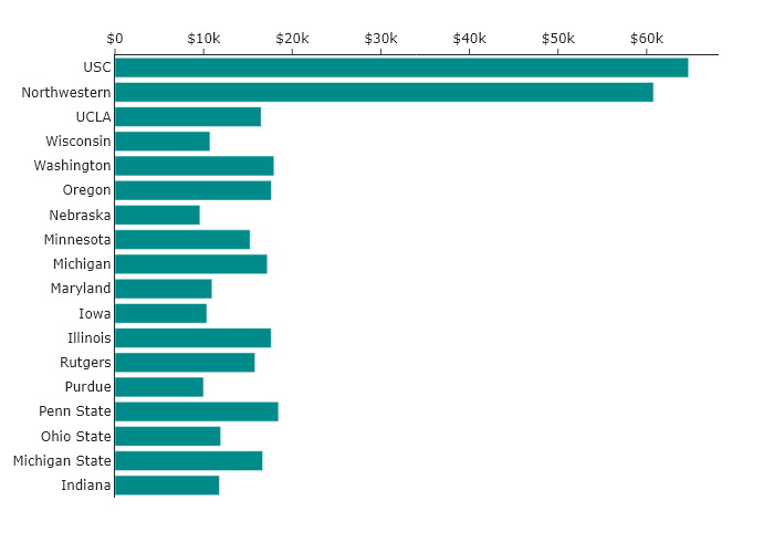
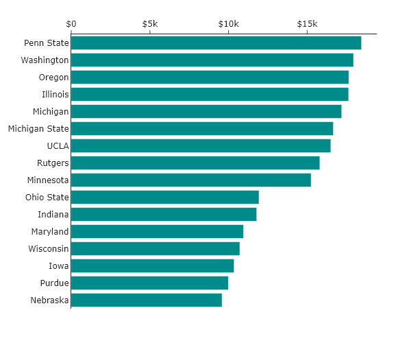
By magnitude #
Perhaps we think the most important aspect of the plot is understanding which universities are the most and least expensive. The simplest way to do this is to arrange the universities by cost. Ordering by this magnitude results in the following:
Whereas the two different orderings above made it very hard to tell if, for instance, Wisconsin was more expensive than Maryland, now we can just directly read this from the chart!
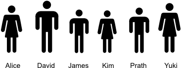
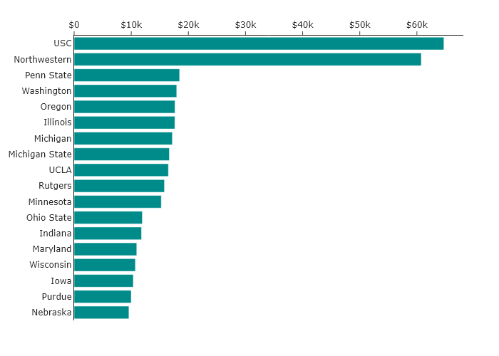
Alphabetical #
What if we thought that the person reading the data visualization would be most interested in a particular school, but we did not know ahead of time which one? Then the simplest way to find it might be by sorting them alphabetically.
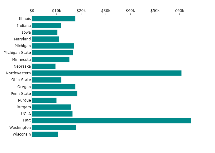
Now it is much easier to find the school of interest, but it is harder to tell what is more expensive than any other school.
Geographical #
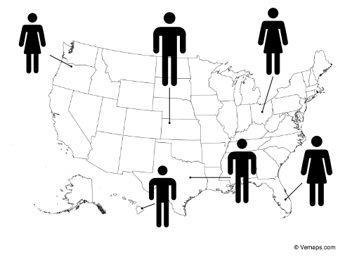
Of course, alphabetical ordering may not be the simplest way for someone to find the university of interest. For instance, how should one sort them? Should “The University of Indiana” be sorted by “T”, “U”, or “I”? Probably “I” is the most useful, but there is some ambiguity. However, for someone with a reasonable knowledge of the geography of the United States, there is no ambiguity about where Indiana is on the map. By placing the universities over their location on the map, one can understand where to find them, perhaps with even less thought.
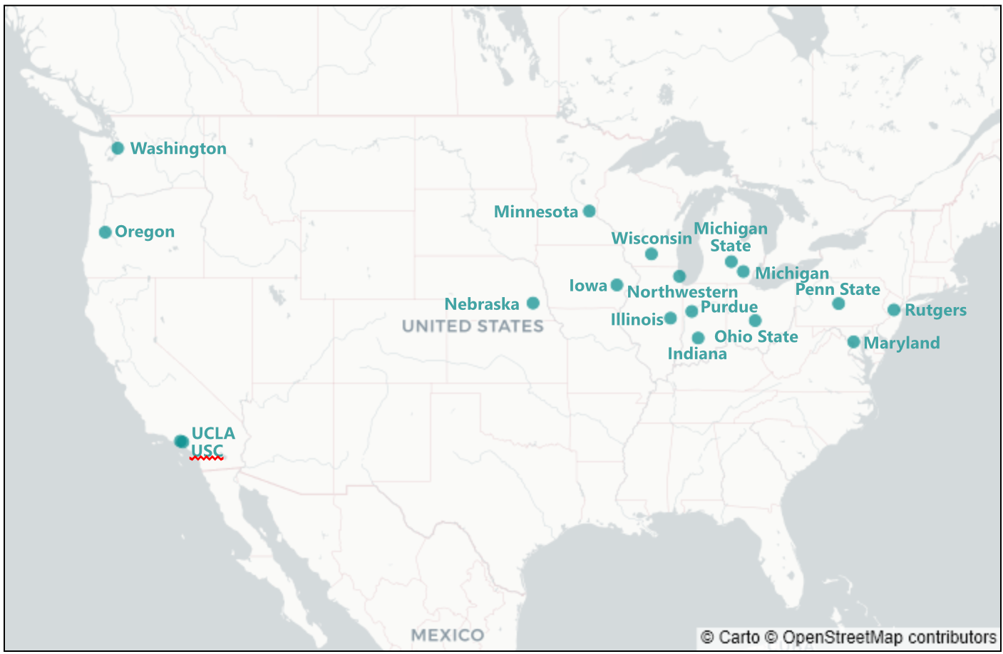
Also, such a map demonstrates the historical origins of the BIG10 among the public universities of the midwest. So, this ordering also shows additional information.
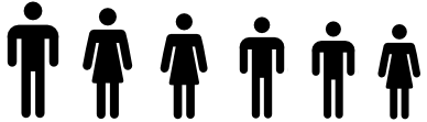
Categorical #
For this specific case, categorical ordering may not be quite as useful as the other orderings. However, the BIG10 does contain both public and private universities, and so one could imagine making two plots, one that allows comparison between public universities, and one that allows comparison between private universities. This might look like the following:
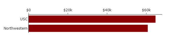
This is a powerful and common use of categorical ordering: you use proximity and separation to group related items, or you “facet” the data into small multiples. This makes the comparisons within a category much clearer.
A special sixth case for data visualizations #
We have just established that the default random order is meaningless. However, there is one advanced case where intentional randomness is the correct and powerful choice: to solve overplotting.
For instance, imagine we arranged the tuition of the schools on a 1D line, just so we can see the spread. The default behavior for a plot might be to use the $x$-values to reflect cost and assign all points with a common $y$-value, as shown below.
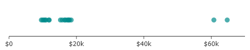
Though it is a bit easier to see the clustering around values than it was for the bar charts, it is hard to see all the points. If, however, we add in random displacement along the $y$-axis, we attain the plot below.
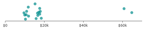
In this “jitter plot,” we are deliberately adding random, meaningless displacement (also known as “jitter”) to make all the points visible. The random values along the $y$-axis have no meaning but do serve our communication of meaning by allowing all the data to be seen.
This is not the same as the default random order we started with. That was accidental meaninglessness. This is intentional meaninglessness, used as a tool to reveal a clearer pattern.
The take-home message here is the same as above: do not accept the default ordering, but apply ordering to communicate meaning.
Key takeaways #
- Order dictates the story: Never accept the default, random order of your data.
- The five hat racks: Every sortable system breaks down into chronological, alphabetical, magnitude, geographical, or categorical orders. Pick ascending/descending depending on what should jump to the user first.
- Magnitude is king for ranking: If you want your viewer to see what is biggest or smallest, simply sort your data high-to-low or low-to-high.
- Alphabetical aids searching: If your viewer needs to find their specific interest rapidly, alphabetize the labels.
- Intentional randomness has purpose: “Jittering” data resolves over-plotting issues by generating intentional noise, but this differs from an accidentally random ‘default’ layout.
$^\dagger$ This is also sometimes called LATCH: Location, Alphabet, Time, Category, Hierarchy/Magnitude.
page last modified February 24, 2026