Proximity and Separation #
last modified February 24, 2026
~5 minute read
As a designer, you use this principle to guide your viewer. Proximity (grouping related items) and separation (using white space to distinguish unrelated items) aren’t passive choices; they are active instructions. You are telling the reader what to compare and what to consider distinct.
In design, space is never empty; it is an active tool for communication. Proximity and separation describe two extremes of spatial arrangement that help the reader understand which objects should be viewed as similar and which should be considered different. Just as the use of contrast requires consistency, it is best to maintain a consistent proximity between objects, using noticeable changes in separation to signify similarity or dissimilarity.
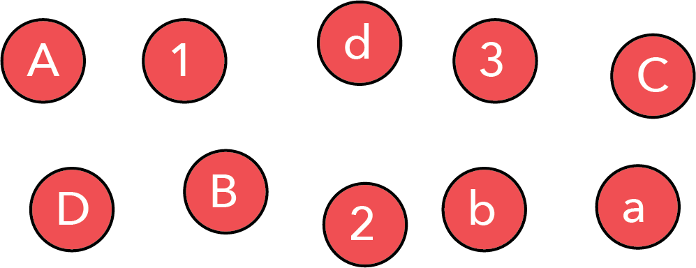
Consider the series of objects shown below. When proximity and separation are not used intentionally, it is hard to perceive any pattern.
However, by simply bringing specific objects together, we can highlight that the collection contains uppercase letters, lowercase letters, and numbers.
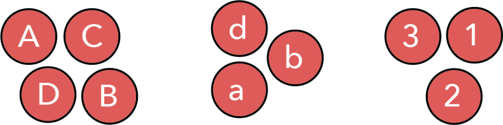
It is important to note that between these two images, the individual objects did not change. All we did was move objects we wished to be seen as connected close to one another, while creating separation between groups we wished to be seen as distinct.
This last point is critical: we have used proximity and separation to impose a specific grouping on the viewer. The viewer will naturally conclude that the data is categorized into uppercase, lowercase, and numbers.
However, this is not the only possible grouping. We can use proximity and separation to guide the reader to an entirely different interpretation—perhaps that we are looking at the first, second, third, and fourth items of a series.
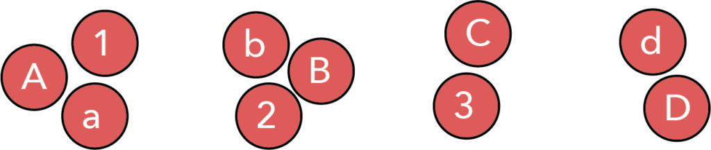
Thus, proximity and separation are powerful tools for helping the viewer see the patterns we wish them to see, gently guiding them toward a specific conclusion.
The use of proximity and separation in data visualizations #
Above, we demonstrated that proximity and separation serve two purposes: making information easy to parse, and allowing the designer to bias interpretation. However, despite their importance, proximity and separation are frequently violated principles in data visualization.
Legends are a violation of proximity #
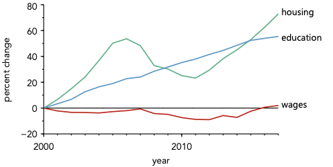
Given the ubiquity of legends, this heading may be surprising, but consider the use of a legend in the plot below:
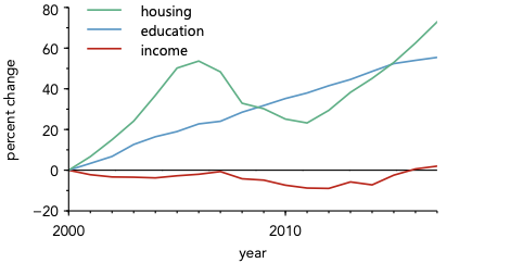
Take a moment and think about what you find most interesting about this plot.
For me, the most interesting aspect is that while both housing and education costs have increased dramatically over the last 20 years, income has been relatively flat. The core message of the plot lies in the overall trends and the relationships between the lines.
Now, consider what using a legend does to the viewer. Before they can focus on these interesting relationships, they must first focus on the legend—looking repeatedly back and forth between the data lines and the legend boxes to assign meaning. Only after this decoding process is complete can they focus on understanding the actual trends. A substantial amount of the viewer’s cognitive load is spent just decoding the plot, rather than understanding its message.
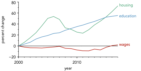
Now consider the alternative: directly labeling the data.
When data is directly labeled, meaning is assigned instantly. The viewer can spend a much larger fraction of their time considering the data itself.
This effect is universal. You should always strive to directly label data whenever possible, accepting a legend only as a necessary compromise when direct labeling is visually impossible.
Beyond spatial proximity #
We have primarily considered spatial proximity, which is the most obvious type. However, there are other kinds. As we will explore in the chapter on color, some colors feel closer together in terms of hue, saturation, or value. We can use proximity in color space to help the reader intuitively group related items.
Consider the plot with direct labeling above. The spatial proximity of the label to the line drastically helps with assignment. However, the association can be made instantaneous by changing the colors of the labels to match the lines, as shown below.
This small change creates a second layer of connection. The label and the line are now linked by spatial proximity (they are close) and conceptual proximity (they share the same color). This dual link requires zero conscious effort from the viewer to parse.
You might also consider this an implementation of consistency. If that view makes more sense to you, that is perfectly fine—as long as you ensure that items which belong together are placed close together and look similar, you are succeeding.
While illustrated here using color, this concept applies to other aspects of design as well, such as choices in fonts and alignment.
Key takeaways #
- Proximity is an active instruction: When objects are close, the viewer naturally assumes they are related.
- Use white space for separation: To tell the viewer two items are distinctly unrelated, introduce visual space between them.
- Ditch the legend: Legends force the user’s eye to physically bounce between the key and the data. Direct labeling leverages spatial proximity to yield instant comprehension.
- Proximity exists in other dimensions: You can employ conceptual proximity by matching colors or fonts to connect related objects instantly, even if they aren’t physically contiguous.
page last modified February 24, 2026