Typography #
last modified February 24, 2026
~12 minute read
I think the Vincent Conare quote (“If you love Comic Sans, you don’t know much about typography. But if you hate Comic Sans, you really don’t know much about typography either.”) encapsulates the selection and usage of font quite nicely.
Below, we are going to discuss typography and font selection. However, much of this page is really devoted to helping you understand why the conventions are the way they are.
Why Sans-Serif? A Brief History of Typography in Data Visualizations #
Before discussing how to choose a font, we should understand why data visualizations look the way they do…
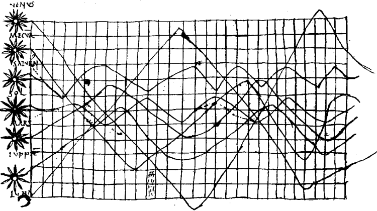
The earliest data visualizations were hand-drawn. The “fonts” were handwritten scripts. There was really no other option at the time, and so making a data visualization with this very old handwritten style will make the data visualization also look very old. One thing to note about these plots is that the lines and markers of the plots were also hand-drawn, and so there are variations in line widths for the data as well.
As the production of books moved away from using scribes to using printers, the inclusion of graphics was done using engravings, where the data visualization would be engraved into a metal plate or wood block and then printed onto the page. The inclusion of graphics was relatively rare, and one could invest a large amount of time into making them. Thus, one still sees flowing scripts, in part as artistic flourish and part to mimic the form of the data visualizations that came before them.
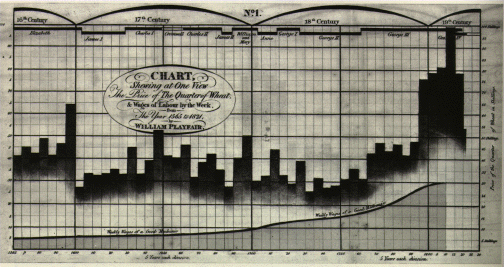
In the 20th century, scientific journals began to include more and more graphics, enabled by the ability to reproduce photographs in printing. In the age before widespread computers, one still needed to draw out the data and then take a picture of this drawing. At the time, most places doing large-scale science (universities and national laboratories) employed full-time draftspeople to produce these figures. To save time and increase uniform appearance, stencils were used to write out the letters. In order to not need to worry about different kerning between all letter pairs, these stencil sets were largely based around monospaced fonts. Many of them also did not have serifs.
The other option was to write out the labels using a typewriter, which typically used monospaced serif fonts.
This is why “old” (i.e., 20th century) data visualizations often use monospace (serif or sans-serif) fonts. Using such fonts in your own data visualizations will give them a “retro” feel because of this. However, if you want to completely reproduce the look, then pay attention to detail! These plots were either hand-drawn using pen or pencil or produced using a typewriter. For the former, pens and pencils have rounded points, and so lines do not end with square truncation but rounded edges. Similarly, the capillary forces of the ink on the physical cutout letters of a typewriter blocks lead to rounded edges on the lettering. Additionally, there can be some very subtle variations in line width and opacity throughout. If you want to completely mimic the old draftsperson style, make sure to pay attention to these details. If you use fonts with crisp edges, it will not look like a mid-century graph, but something closer to the millennium. The reason for this is explained next.
Towards the end of the 20th century, the production of data visualizations became computerized, and draftspeople (and practicing scientists) started making plots on computers, printing them out, and then photographing these printouts to be sent to the journal. During this time, sans-serif monospaced fonts continued to be used, I speculate for two reasons. First, computer displays were low resolution, and so the small serif features were hard to reproduce on the display. This means that sans-serif fonts were used, but (second) the reason that monospaced fonts were used was that people were trying to emulate the products of the draftspeople before them. The difference here, of course, is that one could now produce lines with square edges, and the printing by machine could be done with more uniform lines. Thus, data visualizations with monospace fonts on graphics with square-edged features and uniform strokes gives a feeling of these more modern, but still retro data visualizations.
Finally, we get to the modern era, defined by higher resolution computer displays and journals accepting the data file of plots, rather than photographs. Additionally, the production of data visualizations was largely democratized, as programs like Sigmaplot, Origin, and even Excel enabled practicing scientists to make data visualizations with the press of a button. This combination meant that more fonts could be seen on the screen and (if set to a default) would be commonly used and seen. As computer display resolution improved, more standard fonts could be used, but there was still a time that sans-serif fonts were better looking. For a long time “Arial” was the default option in Excel, and it is probably no surprise that Arial (or other similar sans-serif fonts) is a font that is ‘standard’ looking on modern data visualizations.
The takeaway from this history is that there was almost no period where non-monospace serif fonts were the standard. They look out of place. For this reason using a common sans serif font will largely be a reasonable choice. Only deviate from this when you have a compelling and well-thought out reason to do so.
Special considerations for data visualizations #
Of course, there are still a large number of sans serif fonts to choose from. Here is a practical checklist for choosing a good one.
1. Prioritize Tabular, Lining Numbers #
In typography, numbers are called “figures.” There are two different ways to broadly classify them, based on the horizontal distribution of the numbers and the vertical stretch of the numbers.
For horizontal distribution, the classifications are:
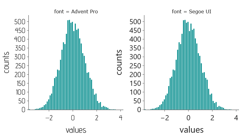
- Proportional: The ‘1’ is narrower than the ‘8’. This looks good in a paragraph but can lead to significant alignment issues in data visualizations (see figure below).
- Tabular: Every number glyph occupies the same horizontal space. This is essential for aligning numbers vertically (for instance, as encountered on a $y$-axis).
Always choose a font with tabular numbers.
For vertical stretch of the numbers:
- Lining numbers. Lining numbers have no ascending or descending features. Thus, the glyphs for numbers all stretch from the cap height to the baseline. This makes things look a bit cleaner.
- Old-style numbers are not this way, and many numbers (such as a “9”) will break these lines. Most modern fonts use lining numbers—a result of the web and the fact that Google used to not display old-style numbers. However, this is probably a fine choice for data visualizations as well.
2. Check your “Greeks and Vees” #
It is worth paying particular attention to the glyphs for Greek letters and Latin letters of similar shape. For instance, the Greek letter $\nu$ can look very similar to the lower case “v”, depending on the font. In the popular font Arial, they are essentially identical: v and ν. Can you tell which is which? On the other hand, some fonts do a good job distinguishing them. In Segoe UI, they are distinct: v and ν.

There are other examples as well. For instance, one might wish to ensure that the Latin I and the Greek iota are distinct.
3. Use the Real Minus Sign #
Not all horizontal lines are created equal. There are a large number of typographic symbols that are horizontal lines, each with their own use:
- The “minus” key on your keyboard is actually a hyphen (‐). The hyphen is for joining words.
- The minus sign (−) is the correct symbol for the subtraction operation or indicating a negative number. It is designed to be at the same height as the plus symbol (+).
- The figure dash (‒) is the horizontal line that is used to indicate ranges of numbers or separating numbers (as in a phone number). For tabular figures, it is the same width as the individual numbers and so is useful when attempting to align numbers vertically.
- The en-dash (–) is used to indicate parenthetical statements in text, and is largely used in countries speaking British English.
- the em-dash (—) is also used to indicate parenthetical statements, but is largely used in countries speaking American English.
Of course, though there are many horizontal lines, there is only a single key for them on most keyboards. So how do you get the correct symbol? There are many ways to do this, but the simplest is to Google these and then copy the character and paste it where you want, or come to this website and copy the correct symbol above.
Advanced Deep Dive: the Language of Type #
If you are enjoying the dive into type, and want to go deeper, this section is for you. Here is the terminology you will need:
- Character refers to the abstraction of the elements of written language. For instance, the idea of the lowercase “a” or the idea of the symbol ampersand “&”.
- Glyph refers to the individual rendering of a character. This is the real-world instantiation of the abstract character. There can be multiple forms of these glyphs for the same character. For instance, the lower case “a” can be represented as one-story (a), two-story (a), serif (a), sans-serif (a), bold (a), and italic (a), to name some options. Even within a single such style, glyphs can change drastically. Examples of sans-serif ampersands are: &, &, &, &, &, &, &, and &.
- Font is a collection of glyphs used to represent language. Thus, Arial is one example of a font.
- Typeface (sometimes called “type”) is the collection of a series of related fonts. The Arial typeface contains the base Arial font, but also Arial Black, Arial Italics, Arial condensed, etc.
The Anatomy of Type #
There are a huge number of different attributes of font, all of which contribute to realizing this contrast, though we will ultimately focus on a few. The image below illustrates a subset of these attributes.
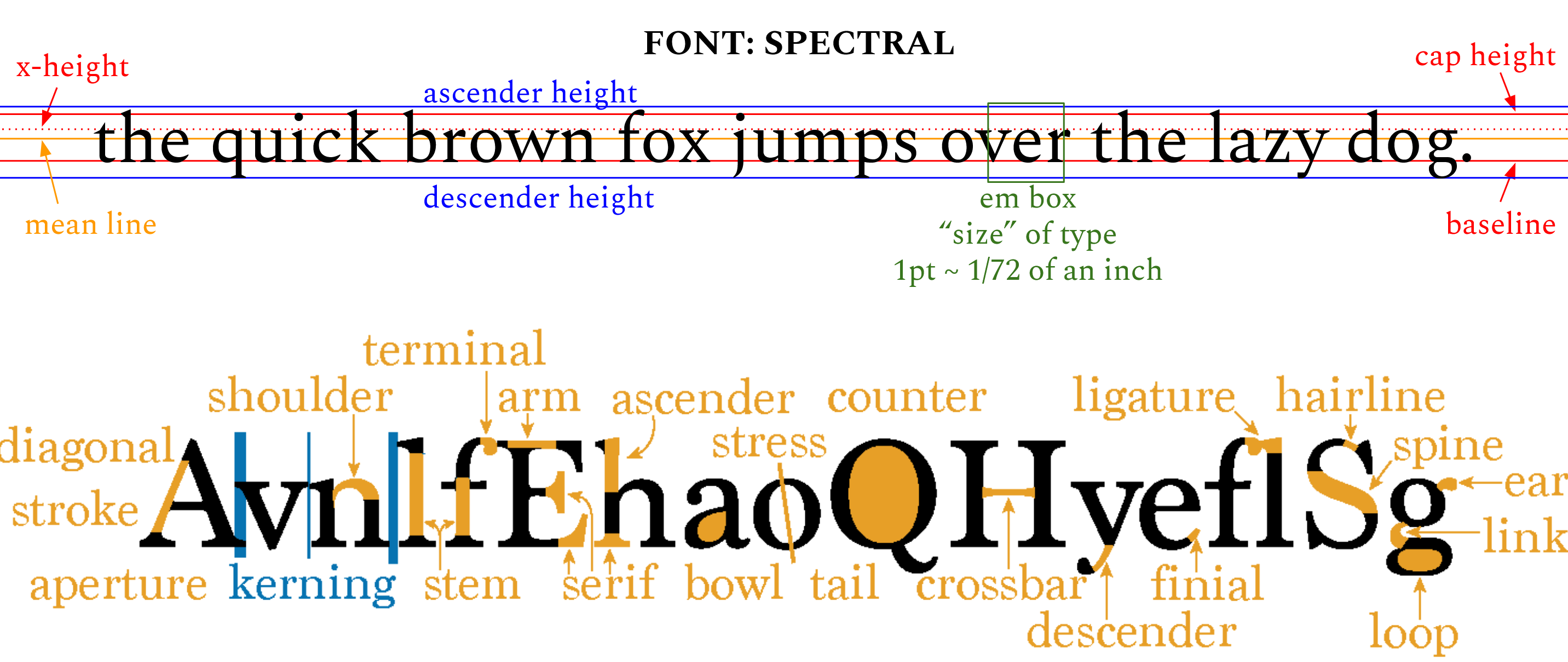
Before we get to discussing contrast between fonts, let us think a bit about some of these attributes and how they lead to contrast between fonts.
- Baseline is the line on which almost all of the lower case and upper case letters sit. This is the strongest horizontal line in text, and so it is important to pay attention to this when thinking about alignment. Some glyphs have components that extend below the baseline. These aspects are called “descenders”.
- Cap-height is the height at which most of the capital letters end. Some glyphs have aspects that extend above this height. These aspects are called “ascenders”.
- Point is $\frac{1}{72}$ of an inch, and is the base unit by which font sizes are measured. This is the “point” in “12-point Times New Roman” that many of us had to use when producing high school papers.
- Font size is the size (in points) of a square that is able to encapsulate the glyph of the capital letter “M” for a font. This is called the “em box”. Why is this the measure of size? Well, it all comes back to the days of physical movable type. Each glyph was on its own type block, and the one for the capital “M” was often the largest block. It is just slightly larger than the actual letter M, because there needed to be a bit of space on each side.
- x-height: The height of the lower case ‘x’. Calibri has a low x-height, while Arial has a high x-height.

- Weight: The size of the stroke used to draw the glyph. Century Gothic has a relatively light stroke, while Impact is heavy.

- Stroke contrast: The degree to which the weight varies throughout the glyph. Arial has no stroke contrast.

- Stress: Orientation of the stroke contrast. Garamond has a vertical stress.

- Serifs: The “feet” at the bottom of some fonts (like Times New Roman).

- Spacing: Usually proportional, sometimes monospaced (like Courier New).

- Kerning: Spacing between specific letter pairings.

- Letter geometry: Geometric basis for shapes, e.g., representing “O” as circular vs. ovular.

There are, of course, other aspects of font that can give rise to contrast, but the above are the most obvious, from my perspective.
Key takeaways #
- Stick to sans-serif: Throughout the history of computerized plotting, sans-serif has become the undisputed standard. A proportional serif font typically looks out of place in data visualization because it goes against established convention.
- Always use tabular numbers: When picking a font, verify that the numbers are tabular (equal horizontal length) rather than proportional. This is absolutely critical for keeping numbers neatly aligned along the y-axis.
- Check for visual separation (Greeks and Vees): Ensure your chosen font differentiates similar symbols, like a Latin ‘v’ and a Greek ‘ν’.
- Use the real minus sign: A hyphen (
-) is incorrectly scaled and positioned for mathematical use. Using a true minus sign (−) pairs correctly with a plus sign (+) and numbers.
Additional resources #
If you want to dig deeper, here are my recommendations on the history and usage of type:
- Thinking with Type by Ellen Lupton: Nice introductions to how designers think about font.
- The Visual History of Type by Paul McNeil: A large number of type examples with discussions of their history.
- Glyph: A Visual Exploration of Punctuation Marks…: A short, fun history of specialized glyphs.
- Shady Characters by Keith Huston: An exceptional history of the characters we use in writing.
page last modified February 24, 2026