Aspect ratio #
last modified February 24, 2026
~4 minute read
Here is a structured workflow for determining the most effective aspect ratio for your visualization.
Option #1: Let Your Data Pick the Shape #
The most effective way to choose an aspect ratio is to allow your data’s primary trend to dictate it.
Research shows that the human visual system is most accurate at perceiving slopes and rates of change when a line segment is angled at approximately 45 degrees. This optimization technique is known as “banking to 45 degrees.”
You can choose your aspect ratio to “bank” your key trend to this 45-degree angle. Consider the $\ce{[CO2]}$ data from Mauna Loa. This data has two trends: a long-term rise and a yearly oscillation.
- To emphasize the long-term rise, we’d make the plot nearly square to bank that data trend to 45°.

- To emphasize the yearly oscillation, we’d make the plot very wide to bank the more rapid changes to 45°.

Aspect ratio can also be utilized to modulate the perceived dramatic impact of a trend. For example, compressing the x-axis into a very narrow plot visually steepens the same rise in $\ce{[CO2]}$, making the trend appear significantly more drastic.

The point is that the aspect ratio is a tool. Use it to make the trends underlying your story—whether it’s the long-term trend or the seasonal change—as clear as possible.
Option #2: When in Doubt, Use one of many Standard Rectangles #
What if your data lacks a single, dominant trend to emphasize? For example, in analytical sciences, spectroscopic data often contains multiple important features that remain visible across various aspect ratios. In such cases, the best practice is to employ a “standard” non-square rectangular ratio that feels intuitive and comfortable to the viewer.
-
The Golden Ratio (~1.61:1): Used in art and architecture for millennia. A classic, proven choice.

Golden ratio aspect.
-
Paper Standards (e.g., US Letter at ~1.29:1 or A4 at ~1.41:1): We are conditioned to find these shapes “normal” from a lifetime of reading.

US Letter aspect ratio.
-
Video Standards (e.g., 4:3 or 16:9): These are also deeply familiar

Video standard aspect ratio.
When preparing figures for publication, I often match the aspect ratio of the medium I am publishing in. So, for American journals, I will match the US letter size, and for European journals, I will match A4, unless the specific data dictates a different aspect ratio (as discussed above).
The Exception: When to Use a Square #
Previously, I stated that one should generally default to a rectangular aspect ratio as opposed to a square. The psychological justification for this is detailed below, but it is important to note there is a powerful use case for square aspect ratios: when you are comparing two variables that share the identical scale and units.
A “correlation plot”—like comparing homework scores to exam scores that both run from 0 to 100—is the perfect example. A square plot with equal axes makes the 45-degree line of perfect agreement intuitive and immediately recognizable.

However, unless your data demands this kind of direct 1:1 comparison, you should avoid a square.
The Psychology: Why Humans Prefer Rectangles #
The recommendation to avoid square plots is not merely an arbitrary design “rule”; it is grounded in human visual perception and biology.
The fundamental reason: our binocular field of vision forms a wide horizontal rectangle, not a square.
Consequently, the visual media we are accustomed to consuming are predominantly rectangular:
-
Phones & TVs: Wide or tall rectangles.
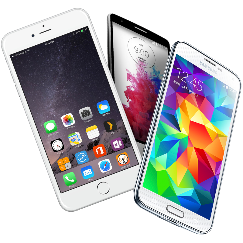
Phone 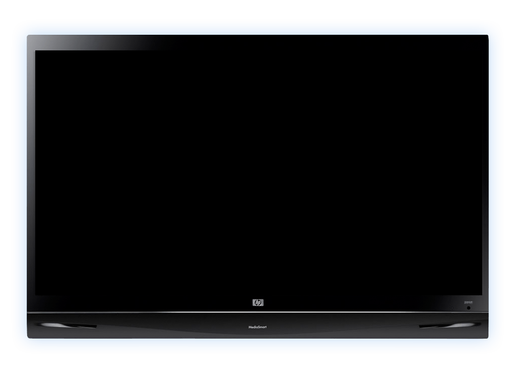
TV
-
Movie Screens: Extreme wide rectangles.
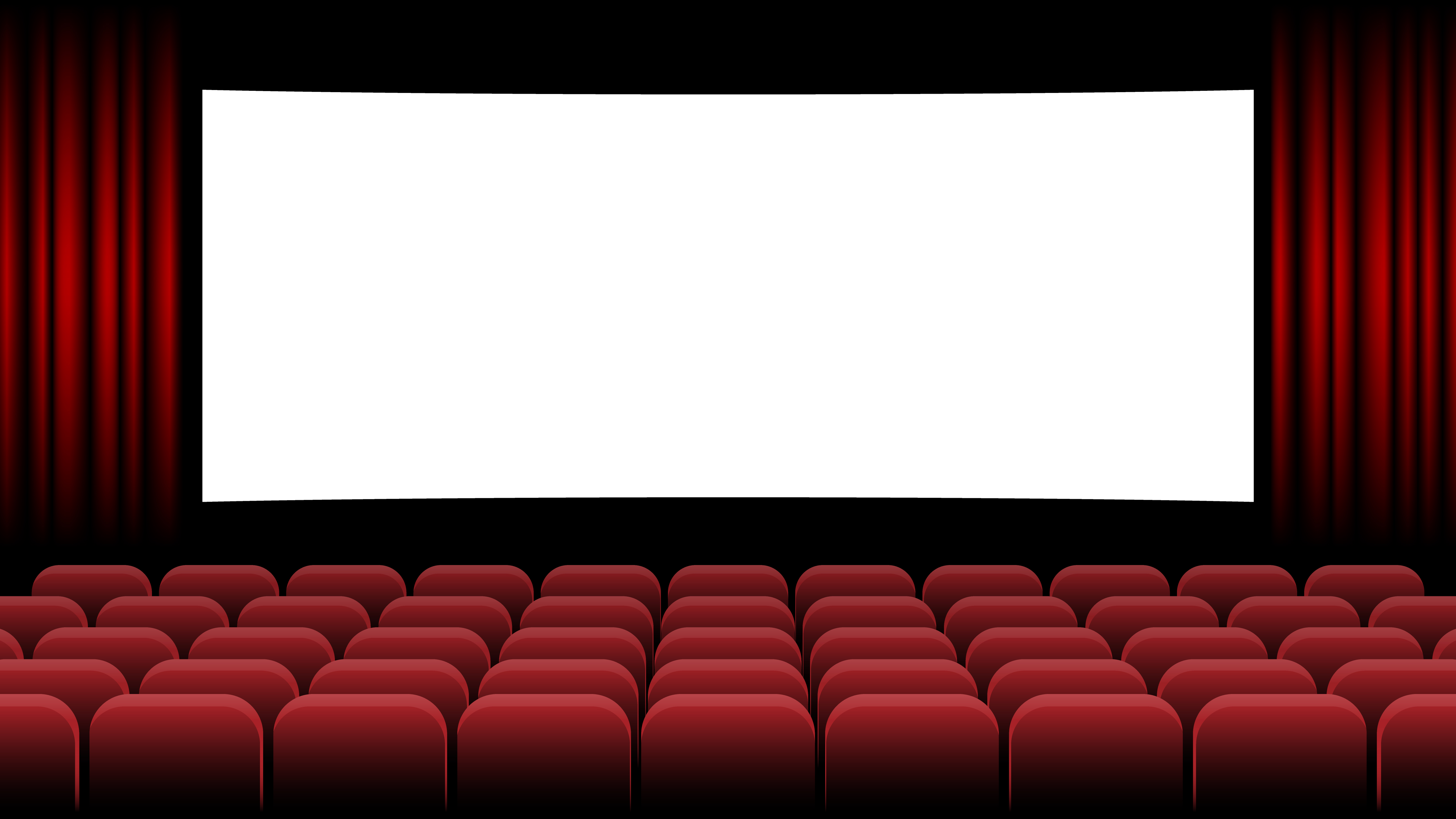
Movie screen
-
Books & Photographs: Standardized rectangles.

Book 
Books
-
Paintings & Windows: Overwhelmingly rectangular.
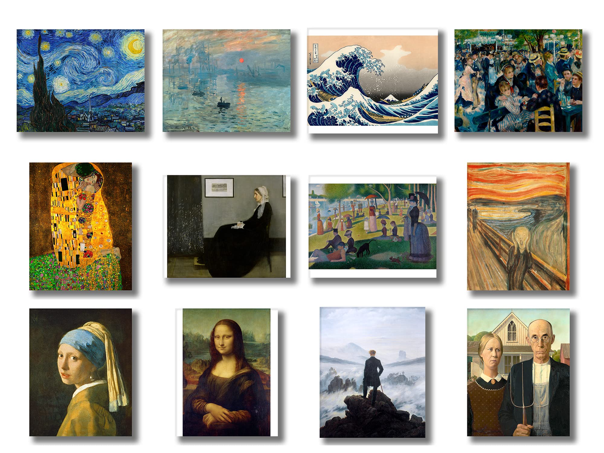
Painting 
Window
When we create objects for visual consumption, we instinctively default to non-squares. In fact, artists that produce square painting are often making a point. Your data visualizations should be no different.
Key takeaways #
Choosing your aspect ratio is an active, data-driven decision.
You have an infinite number of options, but your choice should be simple:
- First, try to let your data decide. Bank your main trend to 45 degrees to make it as clear as possible.
- If there’s no clear trend, default to a standard, familiar rectangle (like the Golden Ratio or a paper size).
- Only use a square when your data (like a correlation plot) specifically demands it.
Ditching the square default is one of the easiest ways to make your plots look more professional and feel more comfortable to your audience.
page last modified February 24, 2026