Axes #
last modified February 24, 2026
~25 minute read
Nearly all data visualizations contain coordinate axes. Even charts that do not explicitly render them geometrically—such as pie charts—are fundamentally constructed upon them. Therefore, it is critical to interrogate the precise role axes serve in a data visualization and determine how to construct them effectively.
## The primary purpose of axes is to provide a means to encode quantitative values #
The fundamental, primary function of an axis is to establish a spatial range against which to quantitatively map data values. That is its singular structural imperative. It may intuitively seem that axes exist primarily to help the reader read those plotted values, but extracting numerical precise data is only a secondary, tertiary, or even wholly unintended consequence of their presence.
One way to understand the truth of the above claim is that we don’t always show axes in our plots. Consider, for instance, a pie chart or a Sankey diagram.


In these plots, no axes are shown. However, the axes must exist. How else could we encode quantitative data onto a page? In a pie chart, the axes are those for a polar coordinates. As one moves from $0 \rightarrow \theta \rightarrow 2\pi$ around the chart, the value $\frac{\theta}{2\pi}$ encodes the fractional position of the data, relative to the whole ($\frac{2\pi}{2\pi}$). Of course, we never show the axes, and this interpretation is implied… but they are present, and they are the way that the data visualization is drawn.
Similarly, the Sankey diagram has an implied quantitative axis. For the data visualization above, this is in the vertical direction, and the value for each flow is encoded as the height along this axis. Again, however, you will never find a Sankey diagram in which this axis is shown. Rather, it is implied. But it is still crucial. The fact that all flows share this same axis means that we can directly compare sizes between flows in a meaningful way.
If you keep your eyes open, you will find many other data visualizations with such implied axes. But, if the axes are not always needed to be shown for a data visualization, then it must mean that the primary purpose cannot be one that requires the axes to be visible. In particular…
The primary purpose of axes NOT to enable precise quantitative readout #
If we recognize that several established chart typologies function perfectly without visible axes, this principle must be sound. To fully appreciate its implications, we must revisit the fundamental purpose of data visualization itself. In that preceding module, I argued that the ultimate goal of graphing data is not to report exact numerical figures (a task vastly better suited to a data table), but to communicate understanding. This understanding emerges from identifying overarching patterns and critical relationships within datasets.
Consequently, when we actively choose to render an axis visible, its design must prioritize how it serves the communication of this high-level understanding, rather than facilitating mechanical value lookup. Furthermore, any design choices implemented specifically to maximize precise quantitative readout are likely counterproductive, as they attempt to force the visualization to perform a task it was never intended to accomplish.
With this principle in mind, let’s design our axes by focusing on two separate jobs: first, designing the scale (the information), and second, designing the frame (the container).
Part I: The Scale #
Quantitative axes #
Quantitative axes are those where the displacement along the axes carries quantitative meaning.
First off, if we are to specify a range of values, we need to have at least two values shown on the axes. There are times that just two values will be sufficient, but there are also times that we might want to have more. We can have a simple guidance here.
Consideration for ticks #
“Ticks” are the locations where we place a label on the axes. In the case of quantitative axes, these labels are numbers. It is typical, though not required to indicate the precise location using tick marks and/or grid lines. It is also typical to show tick marks and/or grid lines, but not place a number label at them. In the case that they bear numbers, we will call them “major ticks”. In the case that they do not, we will call them “minor ticks.” Both of these are used in the visualization below.

Use at least 2 major ticks #
The simplest quantitative axes are linear in scale. That is, the same displacement indicates the same magnitude of change throughout the entire scale. For “complex” quantitative axes (e.g., log plots) will be considered below, but even for the simplest of quantitative axes, we require 2 major ticks to accurately report the scale.

If we have fewer, for instance, 1, it is not at all clear what the scale is.

Use up to 6 major ticks (unless you need more) #
Just because you can get by with just 2 major ticks does not mean that is always the correct design choice. Indeed, for many plots, 2 major ticks will look funny, and also not really provide a useful indication of scale. At least to me, the bar chart above with only 2 tick marks is a bit awkward.
In order to make it easier for the viewer to divide up the scale in their mind, more major ticks are useful. Since we are not trying to make it possible to read out precise numbers, there is no need to have a large number of values written on the axes. We also don’t need to include a large number of tick marks. But just because we don’t need to, does this mean we shouldn’t? How do we provide guidance on whether to include lots of numbers and tick marks or fewer?
There is a well-known concept in art and design history called ‘horror vacui’ (literally “fear of empty spaces”), which observes the human compulsion to continuously fill blank areas on a canvas. Conversely, minimal, open space is universally correlated with elegance and clarity. In the context of data visualization, this tension dictates that we should strive to use the absolute minimum number of tick marks and numeric labels required. Unfortunately, this guideline only instructs us to minimize; it does not explicitly define when we have minimized too broadly.
Determining when a scale lacks sufficient numerical context relies heavily on design intuition. Generally speaking, I find an axis functions optimally with between 2 and 6 numeric references in total. The precise quantity required is wholly dependent on the nature of the data being reported. For instance, when dealing with percentages, plotting only $0\%$ and $100\%$ is often sufficient. However, if a specific threshold is central to the narrative—such as $50\%$—I will explicitly anchor it on the axis. Similarly, if an axis spans from $-100\%$ to $100\%$, denoting $0\%$ provides a critical psychological anchor.
The data dictates this, and so there are also times that I will just mirror the two values, like to 50% values, when I have something that does not change enough for the full range to make sense.

If I am working with just straight values—for instance wavelength of light—then I will often think about the scale over which the patterns in the data are varying. If I have an absorption band that has features that occur on roughly the 50nm scale, I might try showing every 50nm. If it looks too cluttered, then I drop down to the next largest scale—every 100 nm.

The point here is that there is no hard and fast rule. What I am usually trying to accomplish is to use the minimum number of numbers and tick marks I can. So, I start with the minimum that makes any sense. Then I try adding in tick marks. If the visualization is improved by adding them, I keep them. If not, I remove them. This way, I find the minimum number that works for that particular visualization.
Use minor ticks to help clean up axes #
One way to keep the visual indication of dividing up the axes, but reduce clutter is to employ “minor” ticks. These ticks are those that have the indicator of location (tick marks and/or grid lines) but do not have the text label. Removing the text can be surprisingly effective at reducing visual clutter, but their use does raise another question: how many should I use?
For me, I find that minor ticks work best when they are dividing up the major ticks into reasonable chunks, like $\frac{1}{2}$, $\frac{1}{3}$, $\frac{1}{4}$, or $\frac{1}{5}$. Any more than this, and it gets a bit hard to read the individual minor ticks, or to know what scale they represent.
For instance, in our UV-vis spectrum, one might be tempted to keep only the major tick at 300 and 1000, and make the rest minor ticks. But now you are asking the reader to do some reasonable mental math to understand the ticks.

While the use of minor ticks has reduced the visual clutter, it has decreased the clarity.
However, if you simply make different choices on where to place the major ticks, you can have the same reduction in visual clutter, while preserving much of the same clarity.

Here, the minor ticks divide up the major ticks into $\frac{1}{5}$, which is relatively easy for people to see at a glance, so clarity is preserved. At the same time, 6 text labels have been removed…a nice reduction in visual clutter.
Do not put ticks at places that cannot have data #
One more firm rule for me is this: do not put major or minor tick marks at places that cannot have data. This usually applies to cases where the data is discrete. For instance, imagine we had a histogram values from the roll of 2 dice… a classic data visualization in probability theory. If you only simulate rolling these dice a few times, say 10, then there will not be to many counts for any sum of the dice. Then if you plot the data using default settings, you can easily end up with ticks at fractional counts

This makes no sense, as you can’t ever observe 1/2 a count.
The above is a fairly obvious example of where there is a logical problem, but it also comes up in less obvious cases. For instance, time is not discrete (at least in the way that we experience it). But we often discretize it. This was done in the tuition plot above. If we tried to zoom in on just three points of this, the defaults will try to add in tick marks at 1/2 years. But again, there is really no tuition price for the 1/2 year, and so these make no sense. This is especially problematic, if we represent data using just lines, as shown below:

Now, rather than just being meaningless, they are misleading—someone might assume that there is a data point at the tick mark!
There are other ways to solve this problem, such as using markers. But the point remains that it might be best to only place ticks at places we can have data.
Place ticks at round numbers #
If you ask people to count, they will usually do so by 1s or 10s or 100s, etc. These align with our ideas of scientific notation and the SI system. If someone is going to count by numbers other than those, they often will use 2s or 5s. Very few people will count by… say 7s. Thus, a bad example of axis labeling is:

What this tells you is that the mental math of counting is simplest with these numbers. This also tells us that these intervals are the intervals we should consider when designing axes.

We also have to consider where to start and end our axes… or at least where to place the first and last labels. Here again, if you ask someone to estimate a number, they will often give you numbers that end in 0 or 5. So, also take a cue from that, and start the labeling of the axes (to the extent you can) with these ‘round’ numbers.

The point here is that you want to make it as easy as possible for people to get a feel for the data. You don’t really want them spending time trying to do the math… so make the math easy.
Some axes do require exceptions to these guidelines for ticks #
Though the general edict here is to use the minimum number of values possible, there are times that you want more. The most obvious for me is when you have an axis that is in log-space. For such an axis, the numbers are no longer evenly spaced along the axis. However, if you only show tick marks every order of magnitude, this is relatively easy to miss.

To be sure, as soon as one sees the evenly spaced order of magnitudes, then you should be thinking that this is log space, but the fact that we are so used to seeing linear axes, and that the tick marks are linearly spaced makes it easy to just assume this is a linear axis.
By showing 5 or 10 values between orders of magnitude, it become immediately clear to viewer that the numbers are not evenly space, and so provides an easy visual clue that the axis is in log-space. Here, we are employing minor tick marks, as discussed on the page on grid lines and tick marks.

Importantly, the reason to have more tick marks here is not to enable more accurate reading of numeric values, but to communicate a message about the data visualization… that it is not reported in linear space.
Include a bit of buffer at the ends of the axes #
Most people don’t like things that are very tight fits. We don’t like it when we have cars parked too close together. We don’t like photographs and paintings that have the subject too close to the edge. The same for data visualizations: we often don’t like it when bars are markers are too close to the edge. Moreover, if markers run right to the edge of a plot, they can often be cutoff, making it harder to see them. Consider the above plot, but with the x-axis adjusted to run exactly the range of the data… it would be easy to miss the rightmost and (especially) leftmost points!

If you have a bar chart, then running the bar to the exact end of the plotting area can cause some confusion… is the entire bar shown? Or did you cutoff the bar?

For this reason it is a good idea to add a bit of buffer to the axes. That is, make them a bit larger than strictly needed to hold the data. For me, I find that a buffer of roughly 5–10% of the range, on both sides of the data, is a good value. While it may seem that you are sacrificing some plotting area to do this, you will create a plot that is much more pleasant to look at. All of the plots outside of this section use such a buffer.
Include units #
Numbers, on their own, are often meaningless. If you ask someone how far it is to a location, and they answered “10” you might reasonably wonder if they meant 10 miles or 10 kilometers or 10 blocks or, depending on the conversation, even 10 minutes. So, when we specify numbers, we always want to include the units of these numbers.
One way to accomplish this is to put the units directly next to the numbers on the axis. We see this often when working with percentages or money. In such cases, people often put the % symbol after the number or (for example) a $ in front of the numbers. You have seen this in many of the above plots.
However, there are times we might not want to repeat the units at each number. In my own line of work we might have numbers in units of $\frac{ppm\cdot mL}{g}$. Place this after each number would be cumbersome and lead to clutter. Even for something relatively simple like the UV-visible plot shown above, this is true.

The solution is to divide each number on the axis by these units. This makes the numbers unitless, but then we need to note this somewhere. This is often done by placing it in the region of an axis title. Because the reason that the numbers are unitless is because we divided by the units, the SI guidance for labeling units is to place them after a ‘/’—symbolizing division. This is the style I use, and is used throughout this Wiki. However, it is also common to see units placed between parentheses or between square brackets, or even placed next to only one of the numbers on the axis. The conventions vary by field, and you should consider if it is worth it to follow the SI guidance at the expense of your field’s conventions.
Include an axis title #
While simply having units for the numbers is technically correct, it is often quite useful to have a descriptive title for quantitative axes. This is because even numbers with units can be ambiguous. Consider, for instance the number: 2 microns. We know this is a unit of length… but length of what? For this reason, we often include a title that helps establish what is being measured. For instance, we could have “wavelength” (if talking about IR spectra) or we could have “feature depth”, if we are taking about patterns written into a surface. Thus, consider writing a short (but descriptive) title of what is actually being measured.

Categorical axes #
These are axes where the exact displacement long the axis does not carry numerical meaning. Instead, the displacement is used to indicate differences in kind or type. In other words, to help divide up data into categories. A familiar example of a data visualization that has a categorical axis is the bar chart. These charts have 1 quantitative axis, and 1 categorical axis.
There are some special guidelines that apply to categorical axes, and we consider them here.
You do not need tick marks #
Tick marks are intended to help show a precise placement of a value. On a quantitative axis, these essentially are saying’’ of ‘’this point on the axis is associated with this value.’’ But, when thinking about a categorical axis, such precision is not needed. Indeed, it is actually incorrect. Consider a bar chart where there are tick marks on the categorical axis.

Working from above, these tick marks are saying “this exact location is the specific university.” But that is not true. The category is all the places the bar spans. So this category extends to either side of the tick mark. We can solve this problem by removing the tick marks.
Which renders a plot that is no less clear, removes marks that are not needed, and eliminates the erroneously implied precision. I would argue that there is almost never a time that you will need a tick mark to ensure that categories are correctly labeled.
You (probably) don’t need an axis title #
When we were considering quantitative axes, we judged a title to be a good idea, due to the ambiguity of numbers. But when we talk about categorical axes, we often don’t have the same considerations. For one, our categories often do not have units. For another, it often is fairly clear what we are talking about, from the collection of categories.

Consider if we didn’t have the title for the axes… it would likely still be quite clear what is being discussed. Indeed, in all the plots above, we didn’t have this title, and I doubt it was confusing. Thus, for the sake of removing things that are not needed, we often can drop the title on the categorical axes.
Consider running the categorical axis vertically #
When using categorical axes, you are often supplying text labels to the categories. Sometimes, the text can be long. If you have a horizontal categorical axis, this can cause problems, because there is often insufficient room between categories for the entire label. Consider if we had used a horizontal axis for the above bar chart.

You can see that the software I used to create this plot attempted to solve the problem with the labels by turning the text diagonally. However, this is not a great solution for two reasons. First, it is a bit harder to assign text to the bars. Second, reading text on an angle is harder than reading it vertically. So, this is not a great solution.
Other common solutions are :
- include line breaks in the labels, so that we have mini-paragraphs to read. But reading lines with few words on each line is hard. And with narrow bars, it is impossible. For instance, none of the labels above could fit within a single bar.
- turn the text vertical and place it within the bar. But again, we are not really used to reading English text vertically (pro-tip: if you ever are proofing a plot you made, and you have to turn your head to read something, 99% of the time, this means means you designed it wrong.)
The solution to this problem is surprisingly simple and illustrated above: run the categorical axes vertically, so that the text labeling the categories runs horizontally. You can now include longer labels quite easily, and if you absolutely need to have line breaks, you can have longer lines. Also, because the quantitative axis usually has much shorter labels, you often don’t introduce similar problems on this axis. Finally, because you often don’t have an axis title for the categorical axis, turning the quantitative axis to be horizontal means that the title for that axis will be horizontal. In effect, this flip makes it so that you likely will have eliminated all vertical text in your data visualization.
This works so well that I generally recommend making all categorical axes run vertically, when you can. Thus, I recommend horizontal bar charts and Sankey diagrams, for example. Again, this is not a strict rule, but it is the place I always start, using horizontal categorical axes only when the vertical ones really won’t work.
Consider direct labeling #
One last consideration for data that has categorical axes: you might not need to show the quantitative axis at all. Instead, you can directly label the values on the data. This is, of course, the approach that is used in many plots with single quantitative axes, such as pie charts (where counts or % are often directly written on the slices) and Sankey diagrams (where flows are labeled by quantities). For the bar chart we have been considering, this solution looks like:

This is a much more precise way of conveying this value. It also makes it so that we don’t need to include a quantitative axis anymore, which can make a more elegant data visualization.
So, consider if you really need an axis or not.
Part II: The Frame #
Consider placing axes in non-conventional places #
A conventional data visualization places the origin of the $x$ and $y$ axes in the bottom left corner of the plot, so that the $x$ axis is on the bottom and the $y$ axis is on the left. But there is no reason a priori that this must be the case. Thus, if you have data that would benefit from putting the axes other places, do it!
For instance, consider a the bar chart we have been working with, where the bars are ordered from longest at the top to shortest at the bottom and you want to show the quantitative axis. We have been placing the x-axis at the top of the plot, which is not typical, but looks nice. The longest horizontal line is the axis, and then things just get shorter from there, as we move downwards.
If, instead, you put the $x$ axis in the more typical position (on the bottom), the plot looks a bit strange. The bars get shorter and shorter, but then there is a very long line at the bottom breaking this pattern.

This is a subtle point, but much of good design is subtle, and so worth paying attention to!
In my own work, I regularly show electron paramagnetic resonance (EPR) spectra. You don’t need to understand the technique in detail, but it is worth noting that the convention is to plot data that looks like the derivative of an absorption spectrum. In other words, there are positive and negative features and the value ‘0’ has a special meaning. For this reason, I will sometimes put the $x$ axis at the 0 value on the $y$ axis, and then make sure that the $y$ axis has the same positive and negative ranges. This makes is easy to see how the spectrum is distributed around the 0 value, which is a benefit for this data.
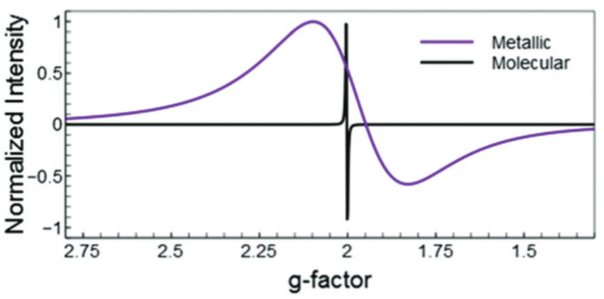
Image is taken from Cirri, A.; Silakov, A.; Jensen, L.; Lear, B. J. Probing Ligand-Induced Modulation of Metallic States in Small Gold Nanoparticles Using Conduction Electron Spin Resonance. Phys. Chem. Chem. Phys. 2016, 18 (36), 25443–25451.
To be sure, most of the time, using the conventional placement of axes will work just fine, and so you might as well prefer that. However, don’t be afraid to consider different placements of the axes, when doing so helps the design of the visualization or communication of its message.
You don’t need mirrored axes #
Many programs have a default to mirroring the axes—that is placing the same tick marks on a line on the opposite side of the main axis.

I believe this is again stemming from the idea that one is trying to enable the precise reading of numbers from the chart. In the days when journals were printed out, one could place a ruler across the mirrored tick marks and try to estimate where the data lay. However, this practice is largely anachronistic, as most data visualizations are not printed out anymore. Thus, if one wants to know the location, you can simply read it from the pixels on your screen, using any one of a plethora of tools. Moreover, as noted above, if you really want someone to know the precise values, you might as well put them in a table.
For these reasons, I think that it is rare that mirrored axes are needed, and so eliminating them will reduce clutter in your plot.
The axis line #
Above, we have been considering how to label the axis, and where to place it. But we still haven’t talk about one feature: the line. Just like all plot elements, we have control over the appearance of this line. The design choices we make regarding this line will have implications for how our plots appear.
Choose a good line width #
The line that you use for axes also can affect the design of your plot. For instance, if you choose a line that is too thin, it can be hard to see, and frustrating to use.

But that is probably better than the opposite: the line being too thick.

In this case, the axes dominate the visual weight of the plot, and the focus is on the axes, rather than the data.
In general, I think about the size I want for the data representation, and then make the axes lines 0.5 or 0.33 times as wide.
Avoid patterning lines #
Unless you have an amazing reason. No one uses them, so they look strange.
Avoid color lines #
Our eyes are drawn to color. So, if you use color, people will look at the axes. This is a similar problem to having the lines too thick.

At times, you will see people that change the color of axes to match that of the data—particularly if you have two set of axes, and you want to associated one bit of data with one axis, and another set of data with another.

While I appreciate the usage of consistency between the data and axes colors, I generally think that double axes are a bad idea. Or, perhaps, that there are better ideas. For instance, rather than trying to show the connection on the same plot, why not use two plots?

.
Or if what you care about the correlation between values, you can simply plot the values versus one another, and this will make any correlation even more obvious!

Above, I have generally said that color of axes is bad. But there is one form that I think makes some sense. Taking a cue from the fact hat colored axes have too much contrast, we can use a grey for the axes, which reduces the contrast, and makes the data stand out even more.

Consider if you need a line #
Sometimes, lines are just clutter. Bar charts often don’t need them on the categorical axes—though I prefer to have them. But even on line plots, you can often get away with not having a line, especially when you are using tick marks.

This can be aided, if you have a filled plotting area.

This sort of filled plotting background, without axes lines is the default for the plotting package, ggplot2. It is very effective, but I think it often is too much ink and also reduces the contrast between the data representation and the background. Thus, I prefer the more standard white background, though the shaded region is also a reasonable choice.
Consider if the line should be placed away from tick marks #
The axis lines are often placed with tick marks touching them. But maybe not always best. Consider if 0 has a special value. Maybe place the line there, and keep tick marks at the bottom. This was the approach used for EPR, above.
Key takeaways #
This section is, perhaps, longer than you might have been expecting, given that it was devoted to an element of plots that maybe you just assumed was a given. However, there are a significant number of things to consider, many of which have material impact on the overall design. Certainly it is worth paying attention to! And we can summarize as:
- Axes are not just a default box. They are a carefully designed system for providing context.
- First, get The Scale right: ensure your labels, ticks, and categories are clear, minimal, and logical.
- Then, get The Frame right: make your lines support the data by receding into the background.
- Get these two parts right, and you’ve built a professional, effective foundation for your data story.
page last modified February 24, 2026