The point of data visualizations #
last modified February 24, 2026
~7 minute read
This website explores the design of data visualizations. Now that we’ve discussed the purpose of design, we must ask what we are trying to accomplish with it. To get to the answer, we first need to dispel a few common myths about what data visualizations are for.
What data visualizations are not #
Data visualizations are not for communicating numbers #
Data visualizations often report quantitative values, making it tempting to assume their primary purpose is to communicate these exact numbers. However, they are often not the best tool for communicating numbers.
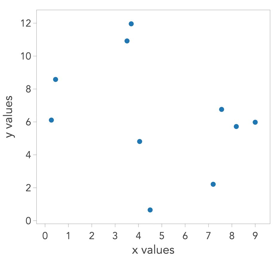
In the scatterplot below, suppose each point represents a value known to two decimal places of precision. Could you accurately extract those exact numbers? Even if you tried to digitize the plot and extract information from pixel positions, ambiguity remains. It is unlikely you could retrieve the numbers with their original precision.
On the other hand, we have a ready tool for reporting numbers with great precision: the table. As shown below, it is trivial to read the numbers with the desired precision from a table. If the sole goal is to communicate numbers, a table is the correct choice.

This realization dictates that we should not design data visualizations around the goal of reporting numbers with precision. This theme is recapitulated throughout this site, such as in the discussions of axes and grid lines and tick marks. While these elements might appear to be for reporting precision, they actually serve other, more critical visual roles.
Data visualizations are not for establishing validity #
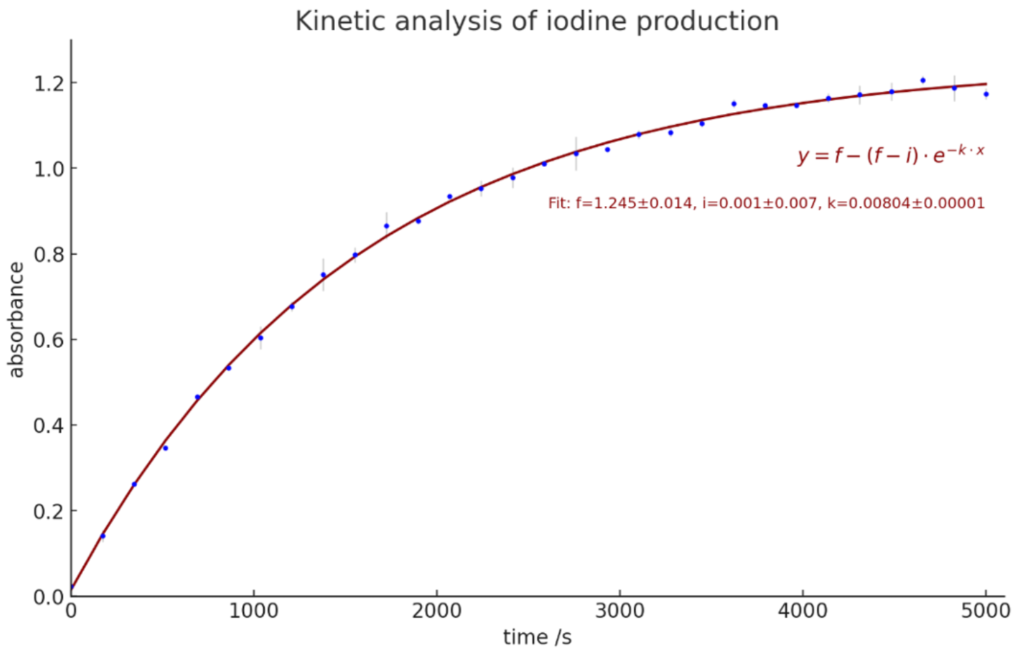
Another misconception is that “showing the numbers” lends validity to the data. While a compelling visualization might make an audience forget to question the underlying data, the visualization itself does nothing to establish validity. A trained eye can sometimes spot bad data in a plot, but a trained person can also easily fabricate compelling graphics. For example, the image below contains completely fabricated data regarding a first-order reaction mechanism. It would challenge an expert to identify it as fake, yet it was readily created using AI, as discussed in a recent Journal of Chemical Education article.
Ultimately, discussions regarding how data is acquired and analyzed serve to establish the validity of methods, not the data itself. We often operate on the baseline assumption that the researcher is reporting their work truthfully. From there, the visualization allows us to judge whether their analysis of that data is sound—enabling us to ask, “If the data looks like this, does their subsequent interpretation make sense?”
Data visualizations are for communicating meaning #
The primary purpose of a data visualization is to show meaning. While meaning can take many forms, we will highlight three common examples below.
Data visualizations can communicate trends (or lack thereof) #
Below is a table of numbers showing the median income in the US between 2000 and 2017. A natural question to ask is: has median income increased, decreased, or stayed the same? You might be able to reach a conclusion by reading the numbers, but it takes time.

Now, if you interact with the table, it reveals a plot of the same data as a line chart. Doing so immediately answers the question. This is the power of a data visualization.
Data visualizations can communicate comparisons and similarities #
We rarely care about data trends in isolation. For instance, the change in income is most meaningful when contextualized against the change in expenses. We can compare the change in median income (green) against the change in median housing costs (red).
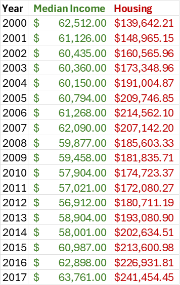
Examining this table, you can tell that housing expenses are increasing, but it is difficult to quickly grasp how this increase compares to the change in income.
Viewing this data as a plot makes the comparison between these trends immediately obvious.
Data visualizations can communicate shapes #
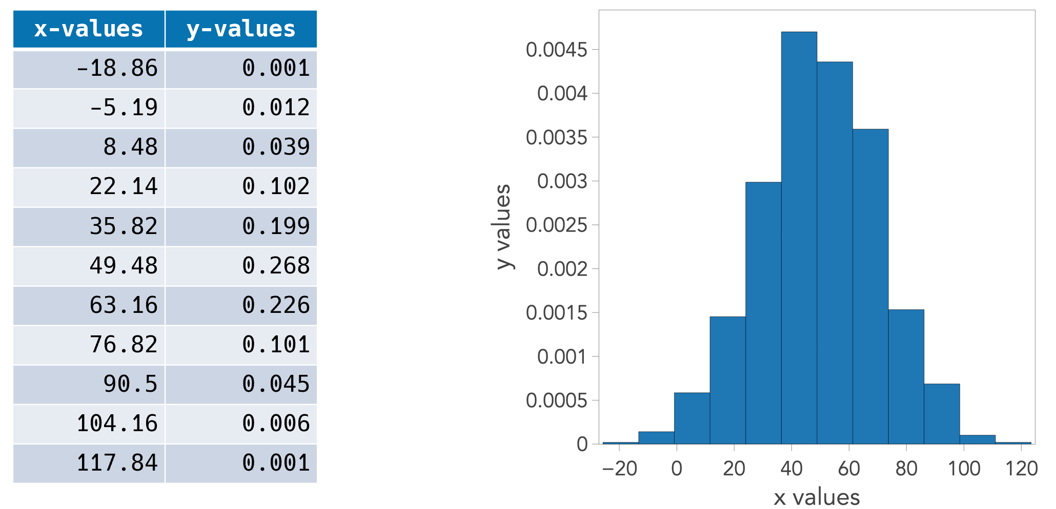
Beyond trends, data has shape. Consider the table below, which shows a set of measured nanoparticle sizes. A natural question is whether the data follows a Gaussian distribution or some other shape, or if the population is multimodal. While a table of binned values contains all the necessary information to determine this, a histogram makes the judgment instantaneous.
A Note on Exploration vs. Communication #
This site focuses on communicating with data visualizations—designing plots to show someone else what you’ve found.
There are, of course, times when you aren’t communicating but rather exploring. When performing exploratory data analysis (EDA) on a new dataset, you typically want to observe the data in as neutral a way as possible.
This distinction is key. The principles of communication allow you to tell a story. As you’ll see, once you learn how to intentionally bias a plot to tell a specific story, you also learn precisely how to remove that bias to create neutral visualizations for your own independent exploration.
Good communication of meaning requires bias #
This might be the most controversial statement on this entire website, but I stand by it.
By bias, I do not mean “lying” or “misrepresentation.” Instead, I mean selectively curating and emphasizing elements to help people see what you believe is there. It is about intentionally biasing a user’s perception of the data to align with your analytical findings. Let us unpack this.
A good data visualization is like good teaching or strong argumentation; it is a form of visual rhetoric. The point of rhetoric is to help someone understand your position and persuade them of its merit. When I teach, my goal is to help students see the world the way I do. Similarly, a visualization guides the viewer’s interpretation.
There is a pernicious idea that a good data visualization has “no bias”—that it is an objectively neutral representation of the data. Leaving aside the fact that pure neutrality cannot exist, we must ask: should we even strive for it?
Returning to the idea of teaching: when I teach, I do not gather everything I know about a subject, dump it onto a slide in a random order, and leave students without guidance. A slide on color organized that way might look like this:
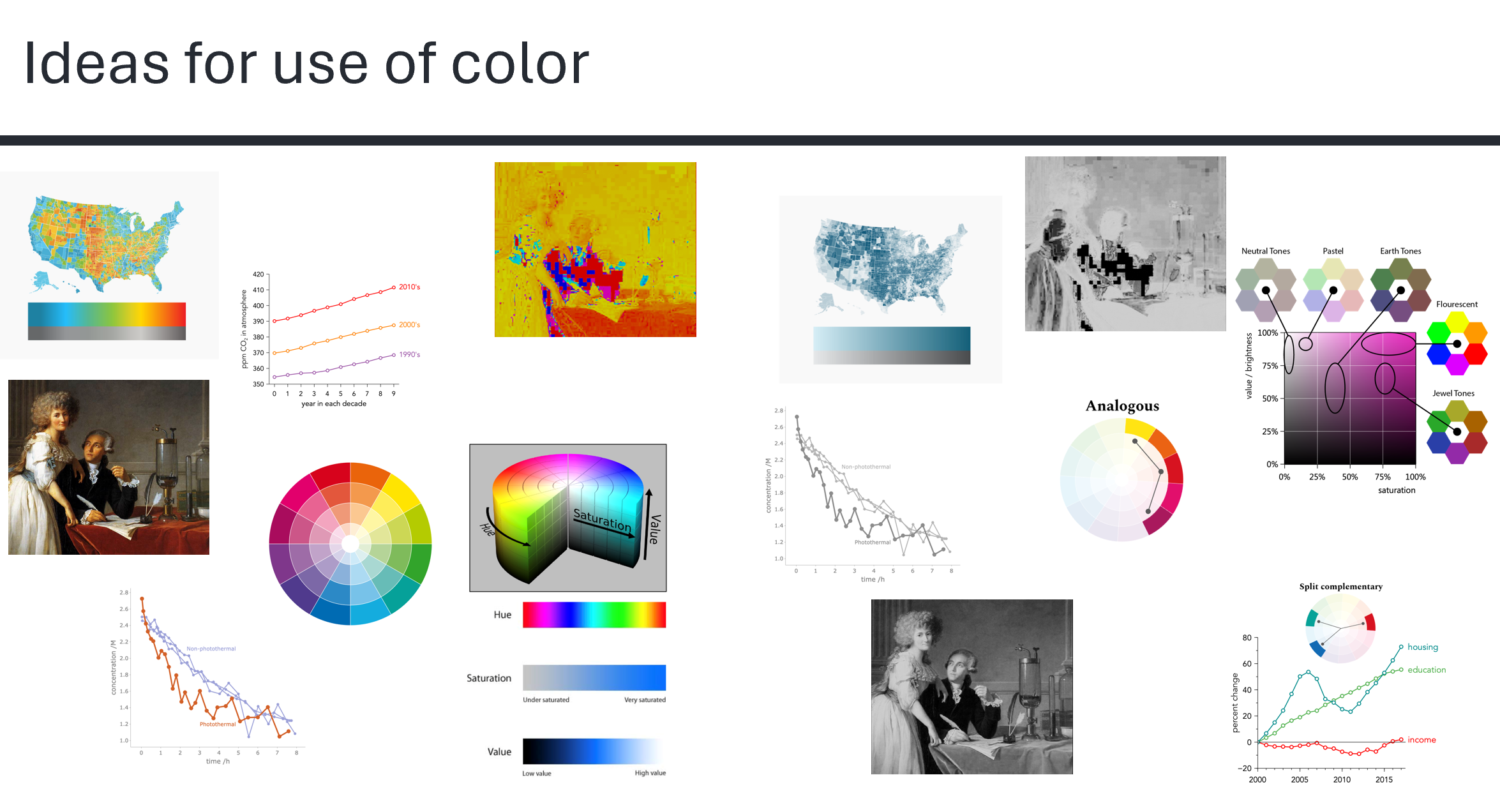
Instead, I carefully evaluate my understanding of the subject, consider what it implies about the world, and organize their presentation so students can follow my reasoning and see why my conclusion is compelling. (To see these specific color concepts presented effectively, read the page on color).
Just as good teaching curates information to foster a specific understanding, a data visualization should strive to highlight what you have found in the data. Because a visualization is always in service of reporting meaning, we must make that meaning as clear as possible. We should make it easy for the viewer to reach the same conclusion we did, while simultaneously providing enough transparent information for them to judge if that conclusion is valid.
Do not lie #
I want to be unequivocally clear: I am not advocating for dishonesty. A data visualization must never misrepresent the data. Instead, it should clarify meaning (which requires editorial bias) while preserving the absolute truth of the underlying data.
A good rule of thumb is The Transparency Test: “If you would feel uncomfortable explaining to your audience exactly what you did to the data or the axes, don’t do it.” This requires an active commitment: whenever you present a visualization, transparently explain how you created it. This is, after all, the baseline standard in science.
Key takeaways #
- Focus on meaning. Do not present charts just to report exact numerical values or to act as proof of valid methods. Data visualizations excel at communicating meaning, like trends, shapes, and comparisons.
- Good communication requires bias. Do not simply show raw, neutrally formatted data; guide your viewer by curating and emphasizing key takeaways.
- Never lie. While you should bias the visual design to clarify your point, the underlying data should remain absolutely true and transparent to scrutiny.
page last modified February 24, 2026