The purpose of design #
last modified February 24, 2026
~5 minute read
Good design isn’t just about making things look nice. It’s a functional discipline built on three core goals.
A well-designed object:
- Makes the task easy.
- Feels natural to use.
- Is beautiful.
Good design makes the task easy #
Bad design can render objects hard to use or confusing. From forks to signs, even simple objects can suffer from poor design.

In these examples, the quality of the design is judged against its intended task: the fork is supposed to allow someone to stab food, while the sign is supposed to clearly convey information. Thus, when designing an object, keep its purpose in mind; consistently focus on what you are enabling the user to do.
When making a data visualization for a publication or presentation, you presumably have found something in your data that you wish to communicate. Therefore, good design in a data visualization seeks to enable the reader to gain this understanding as simply as possible.
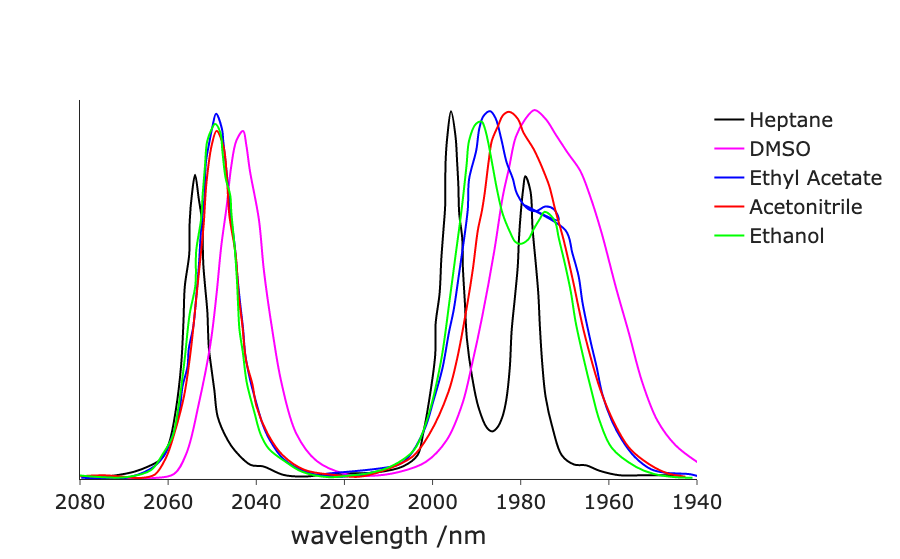
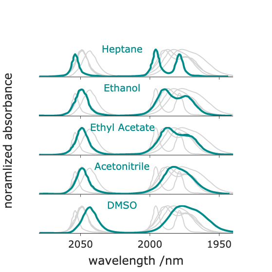
Just as simple objects can be ruined by bad design, poor design can render a basic line chart unusable. Below is a figure I created some years ago. The intent was to allow comparison of the infrared spectrum of an inorganic compound across different solvents. However, this plot attempts to show too much data at once and fails to utilize consistency and contrast (read more here), rendering the comparison unnecessarily difficult (try comparing bands in ethanol versus acetonitrile). The design can be improved by using small multiples, each deploying high consistency and contrast. This update simplifies the task, significantly improving the overall design.
Good design feels natural #
Good design does not exist in a vacuum. You are creating data visualizations for people who expect information to be presented in certain conventions. If you deviate from those expectations, the object feels less familiar, forcing the viewer to work harder to understand it. In design, this is called friction.
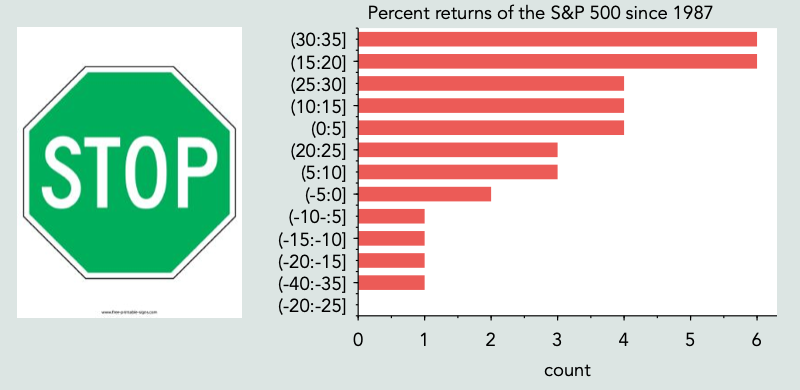
In the real world, a green stop sign is confusing; in data visualization, an ordered bar chart of stock market returns is similarly jarring. The underlying objects and data are familiar, but their implementation violates established norms.
This is not to say that you shouldn’t try new things. Indeed, every current ‘standard’ was once a novel idea. However, when introducing a new visual approach, you must acknowledge the increased cognitive burden placed on the user. Always ask whether the gains associated with a new method outweigh the friction it introduces.
Good design is beautiful #
People like beautiful things. We enjoy interacting with them. If you create a beautifully designed object, people will choose to engage with it, which is an incredibly powerful outcome.
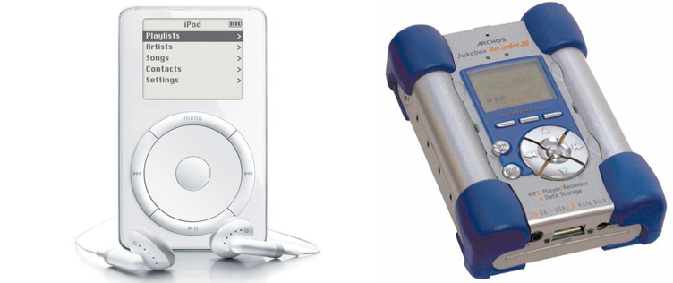
When dedicated digital music players first became popular, Apple introduced the iPod and Archos released the Jukebox. While the Jukebox was arguably a technically superior device by nearly every metric, only the iPod remains universally recognizable today. It triumphed because its design was simpler, more natural, and more visually appealing.
Scientists frequently struggle to get audiences to pay attention to their work. However, if you design the data visualization equivalent of the iPod, people will share your work for you. Consider the two maps of election results shown below.
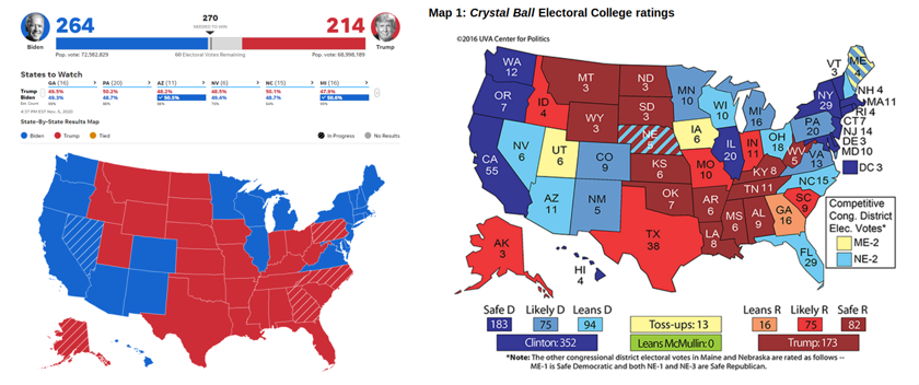
The map on the left is intuitive, reflects how many Americans view US politics, and is visually attractive. The map on the right, while containing more information, is harder to immediately understand and uses a color palette not typically associated with US elections. It is no wonder that designs like the one on the left dominate social sharing on election night.
Your goal is to create objects like the left map: visualizations that allow a reader to easily grasp a complex topic, frame the data within a familiar context, and are enjoyable enough to look at that viewers naturally want to share them.
As for how to accomplish this? That is what the rest of the wiki is all about!
Key takeaways #
- A data visualization must make the task easy. If the goal is comparison, limit variables and distractions. Use techniques like small multiples.
- A data visualization must feel natural. Avoid adding unnecessary friction by violating the conventions established within a domain.
- A data visualization should be beautiful. People engage with information when it is aesthetically pleasing.
page last modified February 24, 2026