Alignment
~10 min read
Every element on the page should have a clear relationship to at least one other element. These relationships can communicate meaning in our designs
Like proximity, alignment is a powerful tool for controlling how people perceive and process graphic information. While most people new to thinking of design might consider alignment simply a way to avoid ‘sloppy’ designs, it is a tool that holds much more power. Here, we will discuss three aspects of good design that alignment accomplishes: establishing a coherence in design, communicating care in design, and aiding in interpretation of our design.
1.4 Coherence
Simply put, objects that are aligned together will feel more connected than objects that do not have clear alignment. This point can be illustrated by returning to the example of the groups of circles introduced in Chapter \(\ref{ch:proximity}\). In that chapter, we saw that grouping like items helped us form associations between objects. The final grouping we arrived at is repeated below, in which there is a clear connection between like elements, communicated by their proximity.
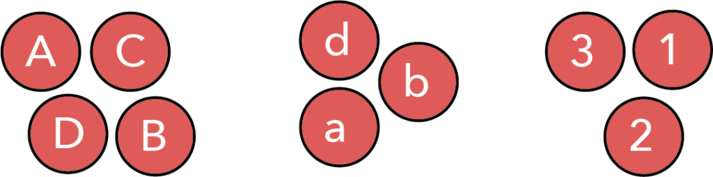
However, the feeling of connectedness between these grouped objects can be further improved by aligning objects within the groups. Our minds simply cannot avoid noticing when things are aligned, and interpret such items as connected.* This is illustrated in the figure below.

Figure 1.
In this figure, we have preserved the grouping, communicated using proximity and separation, but have now aligned the objects within the group. This creates a much more cohesive feel. It is even more clear to the viewer which objects belong together, because of the clear alignment between them.
1.5 Care
This is the closest aspect of design to the idea of avoiding ‘sloppy’ designs. But it is still connected to the idea of coherence. Our innate desire to see things as connected and aligned is why designs that lack clear alignment can feel sloppy. However, the sloppiness occurs when we see things we think should be aligned but are not quite aligned.
Returning to the circles, if we attempted to create the same alignment as above, but did not do so carefully, we might end up with the following.

These groupings are still clearly connected, but now the alignment is off slightly, giving the impression of a sloppy design.
It is important to note that this is a the idea of `sloppiness’ is a subtle effect, because it requires that things are almost aligned, but not quite. The very first image on this page also lacks alignment, but the design is so far from being aligned, that most viewers will not assume alignment is intended. It is when people think that alignment is intended, but not present, when designs appear at their sloppiest.
Though this effect is subtle in its origins, it is important. Though we might hope that our colleagues would be able to look past our alignment problems, the truth is that people will both consciously and unconsciously form opinions based on how we present our data. If we pay proper attention to alignment, we convey that the the user can have confidence that proper attention to detail was paid in other aspects of our work. Thus, tidiness in design is important in that it helps lend a sense of confidence to the rest of our work.
1.6 Interpretation
As was the case for proximity and separation, there is a yet another role of alignment—one that allows us to move beyond creating a coherent tidy whole, and helps us to control how the user interprets what is being presented to them.
Let us consider our circles one last time. Looking at version shown in Figure 1, we can easily see that the top row has more elements than the bottom two. However, it is harder to know why. In other words, if I were to ask you which elements are missing in the bottom two rows, it might take you just a moment to determine this. However, I can alter the alignment between elements to make it immediately clear which elements are missing, as shown below.

Now, we are using alignment to tell the viewer that we are missing the lower case letter ‘c’ and the number 4. Interestingly, though we did not change the bottom row, the shift in the lower case ‘d’ has told the reader that alignment between objects is important, and so it is more clear that the bottom row is missing the letter 4. Thus, alignment is a way to communicate information across the entire design.
1.7 Alignment in data visualizations
All of the above considerations come into play when making data visualizations. Again, the most obvious is care in design. When the subplots of a complex figure are not quite aligned, we can view this as sloppy, as shown below.
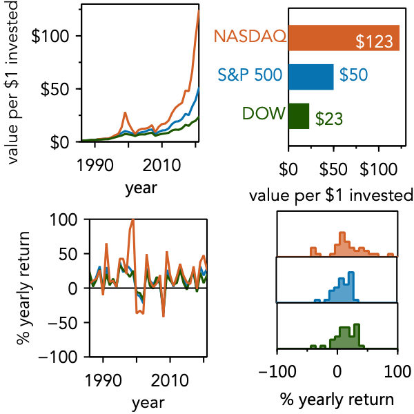
Figure 2.
Ensuring that we have clear alignment between plots can make things look more tidy, and convey that we are taking our work seriously. Though there are many elements that one might align on, the x-axes and y-axes of plots provide strong horizontal and vertical lines on which to produce this alignment, and should be the first place you turn. At a minimum, you should also ensure the tick mark labels and axes titles are also aligned. This can be done by ensuring the text is the same size, and that the offset from the axes are the same. Doing so will go a long way to establishing clear alignment in your figure. As an added benefit, we will produce a figure that feels more cohesive. The figure below is the same as above, simply with improved alignment. The lower figure appears more neat and cohesive. And, as a wise man once said, “Don’t worry if you didn’t notice, your brain did.”

Of course, there are times that we might wish to purposefully destroy alignment, as a way to help a user process a complex plot. For instance, most people who have grown up in a western culture will read a figure left to right, top to bottom—the same as we read text.** Indeed, you most likely read the above figures in this way. However, we can use alignment to try to bias the user away from this order of processing, as shown below.

Figure 3.
This figure eliminates must of the alignment left to right, while preserving alignment top to bottom. This unidirectional breaking of alignment creates a bias to read top to bottom, then left to right. Of course, this bias may not be strong enough to ensure proper processing and so it is also common to use sub-designations to direct the reader’s attention (e.g., Figure Xa, Figure Xb, etc.). However, even when such designations are used, proper use of alignment can aid in processing the figure in the manner we desire, by making the arrangement of sub-designations seem natural.
It is important to understand that breaking the alignment in a single direction is not the same as the sloppy formation of a complex figure seen in Figure 2. There are two differences between Figure 2 and Figure 3. First, alignment within Figure 3 is preserved where it obviously should be—at the very top and bottom—where as in Figure 2, alignment was broken in the places it clearly should have existed. Second (and perhaps more importantly), when alignment was broken in Figure 3, it was clearly broken. One does not have to wonder if the lack of alignment was an oversight—it clearly was not. However, in Figure 2, the alignment is off by just a small amount, which makes the reader conclude that alignment was likely intended, but insufficient care was taken.
This is an important point: by ensuring that alignment is off by a significant margin (rather than a small amount), we make it clear to the reader that we did not intend for there to be alignment. This concept—that when things are meant to be different, they should be significantly different—was discussed at length in the section on consistency and contrast.
Though alignment considerations are obvious when we are making complex figures, they also help us within a single plot. Of course, we rarely have control over alignment of the data, but you do for other elements. For instance, if you are directly labeling your data, as was recommended in the discussion of proximity and separation, then one can ensure alignment between labels. The figure below plots the difference in final value when one invests in the NASDAQ and either re-invests returns year to year or does not, but shows two different direct labelings of the data.

The upper plot does not have a clear alignment between the labels, while the lower plot’s alignment not only helps the labels feel connected, but highlights the use of `not-’ in one of them, simplifying the amount of work the user must do to correctly parse the labels. Thus, paying attention to alignment can aid our viewers in correctly noting the points of interest.
1.8 Some subtleties when using alignment
As we will stress again and again, the most important aspect of design is how the viewer perceives it. Thus, it is important to keep in mind how people perceive objects, and create our designs to provide affordance*** for these perceptions. This is, perhaps most clearly discussed when considering color, but it also applies to alignment.
It can be tempting to think that alignment can be objectively described. For instance, if you have a series of objects, and you want to center align them, you just select them all and then have the computer do it. Of course, the computer has no idea what you are trying to align, and so most programs will simply measure the width of the objects, find the center points, and then align the objects by this center point. This process of alignment yields the results shown below on the left. Though the computer as “aligned” the shapes, many people will view this as not quite aligned. Instead, most people will judge the items on the right as better aligned—despite the fact that they are not aligned in the center, by width.

The problem is that our brains do not always perceive objects the same way a computer does. In this case, our brain automatically is judging the alignment between the perceived center of mass of each shape. Basically, our mind is searching for a reason that the columns are not falling over—even though these are simply shapes on a page! Thus, the consideration of center of mass is particularly important when looking at vertically aligned objects.
Why didn’t we need to worry about this with the plots shown in Figures 2 and 3? The reason is that the axes and boxes around the plots provide a stronger guide for alignment than do the center of masses. This preference for strong lines can also be seen in text. Consider all the letters on the left side of this paragraph. These letters are not aligned by center of mass, but we perceive them as aligned, because of the strong vertical line the produce on the left.
While vertically aligned shapes may need their center of mass to be considered, horizontally aligned shapes often have preference given to their baselines. Just as our brain sees vertically aligned objects as a tower that may tumble, our brain sees horizontally aligned objects as potentially resting on a shared plain.
Again, we can see this in text. Though many of the letters have different heights, they are aligned on a common baseline, and so we judge them as neatly aligned. In turning to shapes, we can consider the three boats drawn below. In the top row, the boats appear to be comically mis-aligned—though they are aligned by center of mass. However, we do not normally think of boats as aligning by center of mass, but by waterline. Thus, the boats on the bottom line appear to be well-aligned to us.

The point of this discussion is that we need to think when using alignment. Consider the objects being aligned and if they have strong lines that will guide our eye. If not, then a more careful consideration of visual weight is needed in order to ensure the design is perceived as aligned. As long as you do so, you will be able to produce designs that the user sees as neat, cohesive, and also subtly guides them in the reading and interpretation of your data.
1.9 Concluding remarks
This section on alignment has been a long. However, I hope you have learned a few things about how and why to use alignment. At the very least, I hope you are convinced it is worth your time to pay attention to alignment, in order to improve people’s judgement of your work. However, I also hope I have shown you that alignment can be a powerful tool to help guide people in their interpretation of your work. Used correctly, clever and careful use of alignment can elevate a piece of work from ‘average’ to ‘amazing.’
Sometimes this idea also goes by the name continuation*. More information can be found in “Universal Principles of Design” by Lidwell, Holden, and Butler.
**This pattern of processing information on pages is so common and so closely tied to reading that it is called a Gutenberg diagram. This is discussed in “Universal Principles of Design,” by Lidwell, Holden, and Butler.
***Affordance is another design principle discussed in “Universal Principles of Design,” by Lidwell, Holden, and Butler.