Color
~8 min read
Color is all about perception The HSV color model is most useful for design From HSV, value is best used for quantitative encoding We can use the color wheel to help us represent meaning in our color choices.
For many people new to design, working with color can be overwhelming. A modern computer screen can display over 16 million colors. It can seem daunting to have to choose from such an array of options.
However, this needn’t be the case. It is surprisingly easy to make good color choices, though it helps to understand how designers approach color before understanding how they choose colors. To this end, we will introduce useful color models and then use this knowledge provide recommendations for choosing colors.
Color IS perception
Because this wiki is specifically aimed at practicing scientists and engineers, it is worth addressing one point up front. Color and photon wavelength are not the same thing. This is a common misconception among technically trained people, but is easily disproven. Consider for instance, the spectrum of light shown below. This spectrum reflects the all the colors associated with the various wavelengths of visible light, running from violet to red. Above this is a magenta rectangle. You will see that the color of this box is not present in the spectrum. Simply put there is no single wavelength of light that corresponds to the color magenta.

Fig. 1. The magenta rectangle at the top presents a color not found in the visible spectrum of light. Instead, magenta is seen when our eyes detect red and blue light simultaneously. Thus, color is not a property of light, but a result of how our brains interpret light.
Instead, magenta is how our brain perceives sensing both red and blue photons at the same time. Similar considerations can be made for many other colors: no single wavelength of light is associated with the color brown, or gray, or teal. Instead, these are formed by the simultaneous detection of 2 or more photons of light.
The key point here is that color is all about perception. This means that we should always try to think about how our viewers might perceive our colors when designing our data visualization.
HSV is a color model that addresses perception
When dealing with the array of colors, people often try to break color into components. For reasons that go beyond the scope of this book, the most common models contain three components.* A ubiquitous model is the so-called rbg color model, which stands for red-green-blue. The reason this is ubiquitous is that our screens use combinations of red, green, and blue light to create the colors we see on them. One can visualize this as a cube, where one edge controls the intensity of red, green, or blue light, as shown below.

Fig. 2. If we have maximum intensity of red light, but no blue or green light, we will be in the bottom left of this cube—which is red. If we have maximum red and blue, we will be in the lowest corner, which is magenta. If we have maximum amounts of red, green, and blue, we will be at the white corner. Adjusting the relative amounts of red, green, and blue, allows us to explore the colors in the rgb color model. Image taken from Wikipedia.
However, though the rgb system might seem like a natural way to discuss color, it is not the most useful for design. Instead, designers tend to rely on a color model called HSV, for hue-saturation-value**. This system can be visualized as a cylinder, as shown below.
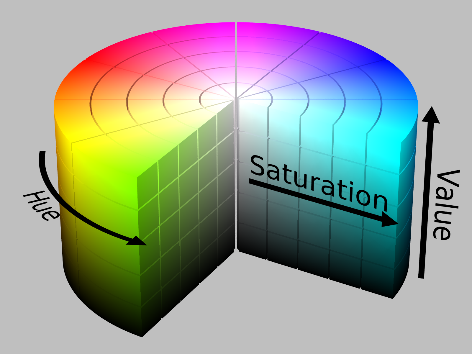
Fig. 3. The HSV color model is often presented as a cylinder. Hue is represented by the angle around the primary axis of the cylinder. Value is represented by displacement along the primary axis. Saturation is represented by displacement along the radius. Image taken from Wikipedia.
We can work with HSV. In this model, hue represents what is colloquially called “color.” Value can be though of as how bright a color is. For instance, you might consider having a lightbulb that will produce some color light (e.g., red). If the lightbulb is off, then we are at zero value. If the lightbulb is on at maximum brightness, then we are at maximum value, and we can smoothly move between these two values. Saturation represents how much of our ‘pure’ hue is added in. If we are at some medium value, then no saturation will be a grey.
The reason that HSV is the preferred model for designers, is that it more closely reflects how humans perceive color. To illustrate this, consider the color ‘families’ that most people know. These families have names like pastels, neons, jewel tones, earth tones, and neutrals. These families reflect different values of saturation and value. Thus, people naturally group colors by these characteristics.
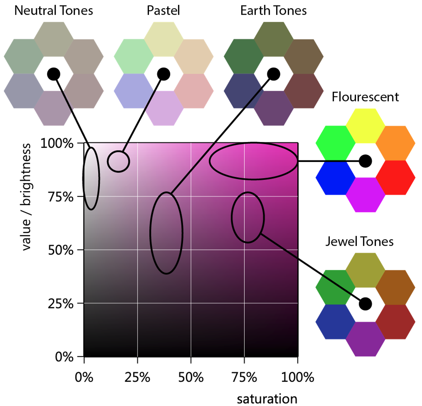
Fig. 4. This plot presents changes in both value and saturation for a specific hue. In this sense, we might consider this a slice along 1/2 of our HSV cylinder. Indicated on this plot are different regions of value and saturation, and then we show examples of color wheels that fall in these regions. Thinking in these terms is so common, that these regions have familiar names. Image by Ben Lear.
Value is the most critical component to consider
When working with data, there is another benefit to working with HSV. It turns out that the HSV system isolates an aspect of color that the human brain can most easily quantify: value. To illustrate this point, we can consider a painting where we have preserved just the channels of hue, saturation, or value. In this, you can see that the value is what provides our brain the most information about the image.
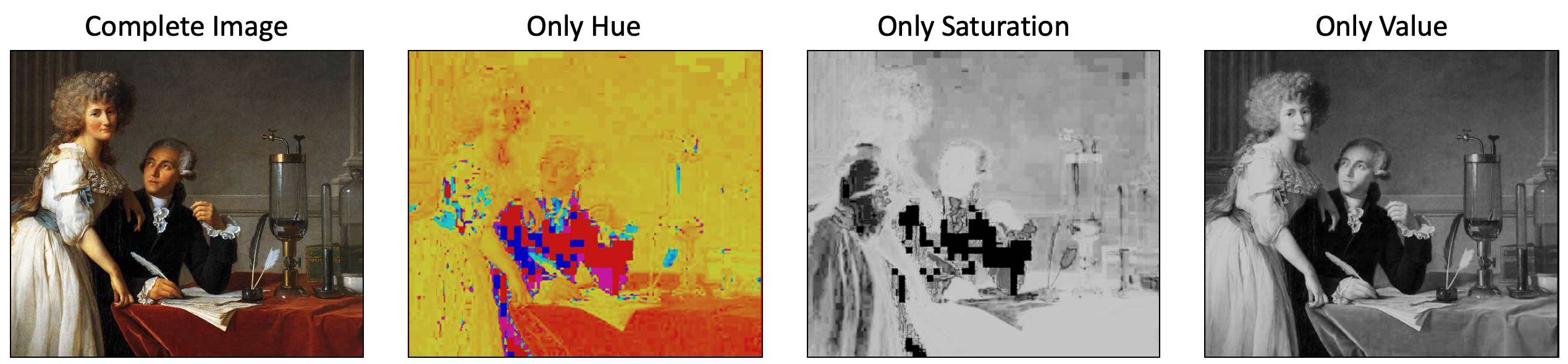
Fig. 5. If we take a full color image and then isolate the hue, saturation, and value channels, we find that the value channel, by far, best preserves the information in the original image.
Original image from Wikipedia. Altered images by Ben Lear.
From this, we already have two good rules for working with color:
- The best contrast in colors will come from colors that differ in value.
- If you want a color change to reflect a quantitative change (aka. a color map), then choose a map that varies in value.
This last point suggests that we mapping requires finding color maps that are perceptually uniform in terms of their colors. Fortunately, there are good online resources to find such maps. This is discussed in more detail in the chapter on color maps.
Using saturation and value together
As shown in Figure 4, we tend to group colors into families, based on their saturation and value. Thus, while value can be used to create contrast, consistency in design is attained by working within a single color family. For instance, if we have a plot with several lines on it, we might choose colors within a single family, to create a cohesive feeling.

Fig. 6. Here is shown a line plot where the lines have colors taken from the jewel tone color family. The choice of working in the same region of saturation and value means that contrast between lines is not as high as it could be, however, there is a greater sense of cohesion as a result.
Choosing hues
Though the emphasis has been on value, hue is also important. While value can be used to indicate quantitative changes, hue can be useful for indicating changes in categories. Hues can also be used to create associations. Most people will view blue and green as more similar to one another than they are to red. Thus, one can select these colors to communicate which sets of data should be more closely associated with one another, as illustrated shown below.
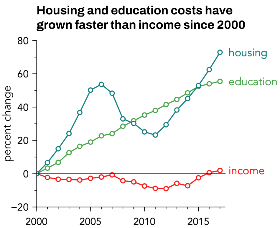
Fig. 7. In this plot, we show trends in housing and education costs, as well as income. Since housing and education are expenses, we want to visually convey them as more similar, and quite different from income. This is done through choice of hue.
The perceived relationship between hues is common enough that we have words for them. We call blue and green analogous colors, while we call red and green complimentary colors. We can also see this in the arrangement of the color wheel. On such a wheel, blue and green are close to one another, while red and blue are opposite one another. Using the wheel, we can develop other heuristics for handling color choices, in order to emphasize different relationships between data. These relationships are also given names, as illustrated below.

Fig. 8. The color wheel (left) is a convenient tool for choosing colors. From this, we can develop a number of heuristics that we can use to communicate associations between data sets.
Figure by Ben Lear
Thus, if one understands the relationship one wishes to highlight, then one is well on their way to choosing colors. In general, a workflow for color might look like this:
decide on message → choose color family → choose correct heuristic for your message
Plan for accessibility
However, there are also a number of other considerations that come into play when choosing colors—considerations we can collectively call ‘accessibility.’ The idea is that one must consider the manner in which your data visualizations will be viewed to ensure you are making good color choices.
Perhaps the most common consideration is to ensure that your choices are colorblind friendly. A bit over 5% of the world’s population cannot distinguish between reds and greens. Thus, even though red and green might look like good choices to those with normal color vision, this is a problematic paring for a significant number of people.

Fig. 9. The top of this image shows a color wheel and bar chart seen under normal color vision. to the right of this are shown color wheels and corresponding bar charts, simulated for various forms of colorblindness. Also given are the rough percentage of the population with these forms of colorblindness. Clearly, color pairs that are easily distinguished by people with normal color vision can become very low contrast for people with colorblindness.
Figure by Ben Lear
To ensure that you are producing images that are colorblind friendly, you can use modified color wheels, as shown above, or you can use online resources like colblinder to simulate how your designs will look to those with colorblindness.
Though colorblindness is perhaps the most commonly talked about consideration for accessibility, it is also worth considering the size of your design. The reason is simple: the degree of contrast between colors will depend on the size of the colored objects.
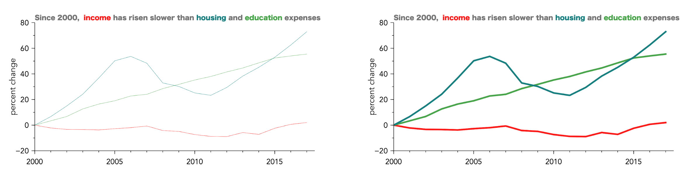
Fig. 10. These two images show the same data plotted using the exact same colors. However, the lines are different thicknesses. Here, you can see that the contrast between the blue and green colors is more clear on the right image, illustrating the importance of considering size in design.
Figure by Ben Lear
Good tools exist
Even though the intension of this discussion was to help you approach choosing colors with more confidence, you may not yet feel confident in choosing colors. That is ok! You will make progress with purposeful practice.
Also, you don’t have to go it alone! There are many good tools to help you choose colors. Here are two of my favorite:
- https://coolors.co/: This is a website with an excellent color picker/generator, as well as contrast checkers, and community submitted color palettes. This is an extremely good resource when searching for color ideas.
- Colblinder: This is a website where you can upload an image, and click through various simulations of colorblindness. This is extremely helpful in checking your complete designs. Additionally, it will simulate grey-scale images, so you can see how designs will look on black and white printers, or on most ereader screens.
*I am specifically thinking of additive colors (such as what is shown on a screen). The common model for colors in print (subtractive) has 4 components and is called CMYK.
**Value is also sometimes called “brightness.”