Proximity and Separation
~5 min read
Place items that are related close together on the page.
Separate items from one another, if they are not related.
Proximity and separation describe two extremes of spatial arrangement that can be used to help the reader understand what objects you wish them to view as similar, versus which objects you want them to consider to be different. Similar to how the use of contrast requires consistency, it is best to try to maintain a consistent proximity between objects, and then use noticeable changes in separation to signify similar/dissimilar objects.
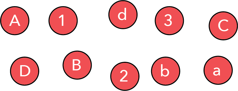
Consider the series of objects shown below. If proximity and separation are not used, then it is hard to perceive any pattern in the objects.
However, simply brining together these objects we can highlight the fact that the collection contains upper case letters, lower case letters, and numbers.
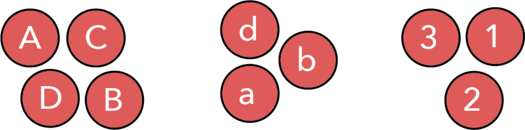
It is important to note that between these two images the relative ordering and arrangement of the objects did not change. All that has changed is to move objects we wish to be seen as connected close to one another, and create separation between those we wish to be seen as different.
This past point is a critical one: we have used proximity and separation to impose an idea of how to group objects on the viewer. The reader will reach the conclusion that there are upper case, lower case, and numbers.
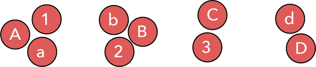
However, this is not the only possible grouping for these objects. Indeed, we can use proximity and separation to guide the reader to a different interpretation… perhaps that there are the first, second, third, and forth items of each series.
Thus, proximity and separation are powerful tools for helping the viewer see the patterns we (the designer) wish them to see, and for reaching the conclusions that we hope they will.
1.1 The use of proximity and separation in data visualizations
Above, we have seen that proximity and separation serves two purposes. First, it functions to make the parsing of information easy for the viewer. Second, it allows the designer to bias interpretation of the image in the way that they wish. However, despite the importance and power of these two aspects, proximity and separation it is a commonly violated principle in data visualizations.
1.1.1 Legends are a violation of proximity
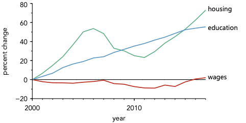
Given the ubiquity of legends, this heading may be hard to believe, but consider the use of a legend in the plot below:
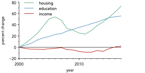
Take a moment and think about what the most interesting aspect of this plot it.
For me, I think the most interesting aspect is that both housing and income costs have increased over the last 20 years, but income has been relatively flat. In other words, the most important aspect of the plot is the overall tends and relationship between the lines.
Now, consider what using a legend does. Before the viewer can focus on these interesting trends and relationships, they must first focus on the legend—looking repeatedly back and forth between data and legend in order to assign each data line appropriately. Only once this assignment is made can they focus on understanding the trends and relationships shown in the plot. In other words, a substantial amount of the time a viewer interacts with this plot is spent looking at non-interesting parts of the plot.
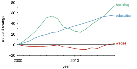
Now, consider the alternative: directly labeling data as shown below.
When data is directly labeled, instead of using a legend, assignment of data is quicker and easier. This means that the viewer is able to spend a larger fraction of their time consider the data—rather than simply trying to assign it.
This effect of using a legend is genera. Thus, one should always strive for direct labeling of data whenever one can, accepting the use of a legend as only a compromise for figures where directly labeling is simply not possible.
1.2 Other types of ‘proximity’
Above, we considered spatial proximity. This is the most obvious type of proximity. However, there are also other kinds. As we will explore more in the chapter on color, some colors feel closer together, in terms of hue, saturation, or value. Thus, we can also use proximity in color space in order to make the reader see things as related.
Consider the plot with direct labeling. The direct labeling helps us assign the lines—that is true. However, the association between the labels and the data can be made even stronger by changing the colors of the labels to match those of the lines, as shown below.
Of course, one might also consider this to be an implementation of consistency as well. If that view makes the most sense to you, then I won’t quibble—as long as you make things that belong together as close together and as similar as possible, then you are doing the right thing!
Though I have only illustrated the use of this idea for color, I should also mention that it applies to other aspects of design, such as choices in fonts, choice of alignment, and so on.
1.3 Concluding thoughts
The take home from this page is that, if one is trying to make things feel connected, place them close together, and also make them look as similar as possible. This last point echoes the insight from our considerations of consistency and contrast.
It is also important to remember that the primary goal of design is to help guide the user’s interaction with the object you have created. For data visualizations, this means helping them reach the conclusion you have about your data. As discussed further on the page dealing with ethics in data visualizations, this is not the same as biasing the data, or leaving data out. The goal is to show all the data as accurately as you can, but also help the reader see the same message you have taken from the data.